How do I add Branding and End Card to my Click-to-Watch video campaign?
Branding and end cards are elements that will allow you to create a fully branded experience for your Click-to-Watch campaign, with a custom background, a logo, and an extra CTA button to drive action. This article will walk you through the set-up of both elements.
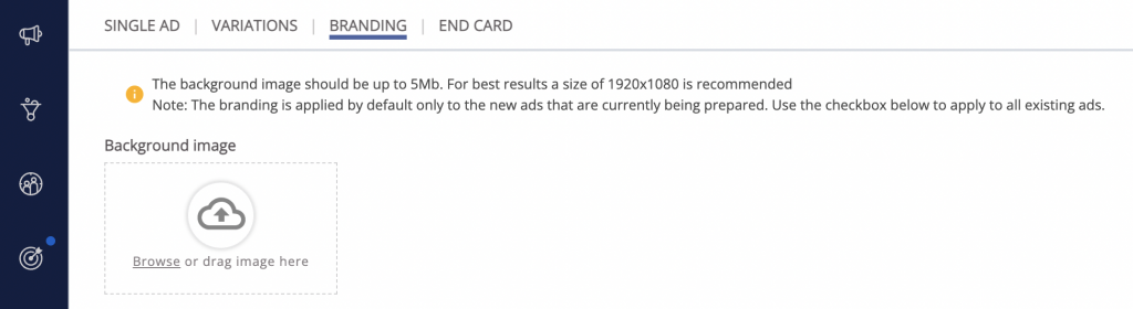
Adding Branding
Branding elements include a background image, a logo, and a CTA and can be used to enhance the branded video experience on desktop devices. You can add these elements in the “Branding” tab during Click-to-Watch video campaign creation or when adding video ad content.
- Background image: Mandatory element that will be featured all around the player. It should be large (in terms of screen size) and full (with no black box shown in the middle).
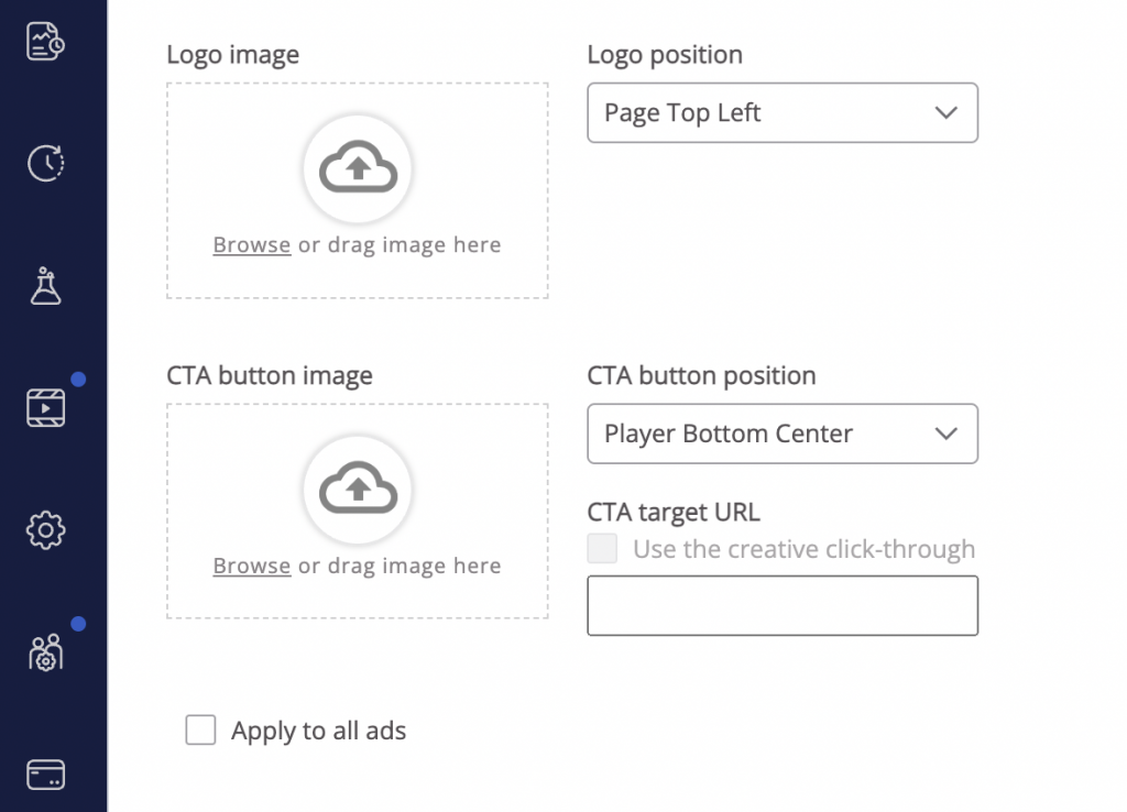
- Logo image (PNG): Optional element that features your brand’s logo on top of the background image. Use “Logo position” dropdown to select the desired logo position.
- CTA button image: Optional element that can be set either on the video itself (integrated within the VAST tag URL) or on top of the background image.
- CTA button position: Use the dropdown to the desired CTA button position.
- CTA target URL: Insert the landing page URL you want users to be redirected to when clicking on the CTA button.
The preview will appear on the right side of the dashboard after you’ve inserted the desired elements. When you’re happy with the results, continue to add the End card.
Adding End Card
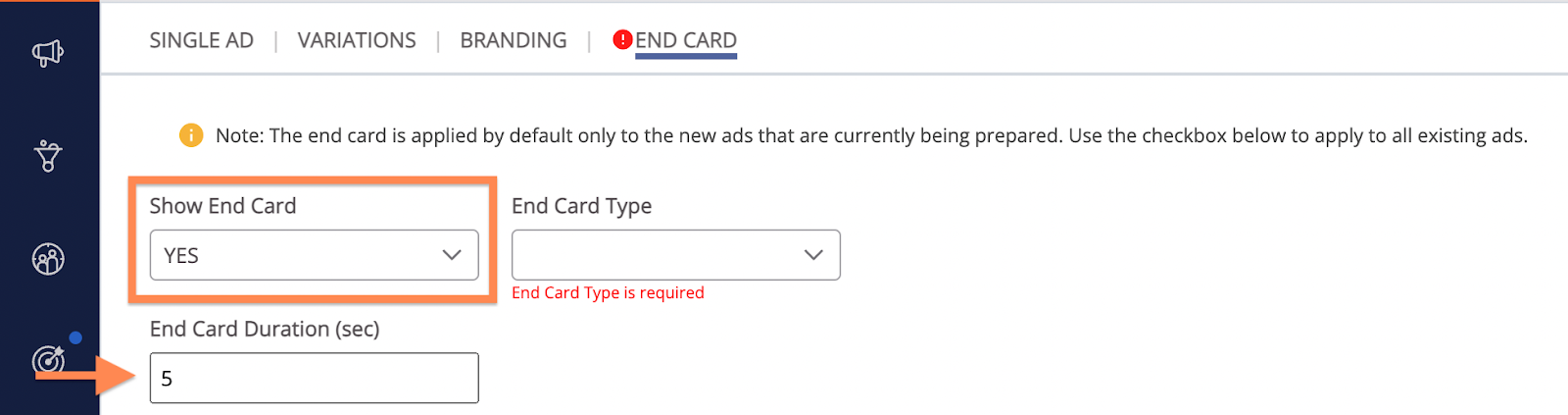
End card is an optional feature available for Click-to-Watch campaigns. By displaying a large CTA button or a picture on the video overlay after the video has finished playing, it gives the consumer an additional opportunity to interact with the ad and drive action for your campaign.
End cards can be configured in the “End card” tab during Click-to-Watch video campaign creation or when adding video ad content.
- Show End Card: By default, the end card is set to active. If you don’t want to add it to your ads, switch the “Show End Card” to “No” in order to be able to save your campaign/ad.
- End Card Type: Mandatory field that offers predefined text options for the End card CTA button. Choose one of the options from the dropdown menu to select the desired type.
- End Card Duration: The end card can be set to show for up to 10 seconds. Recommended duration is between 6 and 8 seconds, but no shorter than 4.
- CTA Button Image: Allows you to upload your own End card CTA button image. The uploaded image will override the selected End Card Type.
*Please note: The selected image should contain the text as part of the image. The predefined or custom text cannot appear on top of it – in this case, the text will be replaced by the selected image.
- CTA Image Position: Defines the exact position of the CTA image. Select it by choosing one of the options from the dropdown.

- Show End Card Border: End card border is the white frame surrounding your CTA button. Select “Yes” to enable it.
- Show Video Last Frame: Uses video’s final frame as the background for the CTA on the End card and is shown to keep the user in the context of the video they are watching.
- End Card Target URL: Defines the landing page to which you’d like to redirect the users after clicking on the End Card CTA button.
- Pixels: Optional click-tracking pixels. If using several pixels, separate them using commas [,].
- CSS (optional): Advanced feature allowing you to further customize the End card to a custom look and feel. CSS is recommended in case you have a non-standard visual requirement.
Important note:
- After you’ve saved your campaign, you won’t be able to add End card or branding elements. You can clone an existing campaign and add it later.
What’s next?
Once you’re finished adding the desired elements, you’re ready to continue with the rest of the Click-to-watch campaign setup.