How to Make the Most of Your Thank You Page


Everyone appreciates a “thank you.” This is true in business, interpersonal relationships, and also your digital marketing campaigns.
After a customer has converted, say, by completing a sign-up form or downloading an eBook – the polite thing to do is to say thank you. Not just a common courtesy, a well-designed thank you page also indicates to the user that their request has been received or action registered.
While this may seem like the end of the story, it really signifies an opportunity to develop a much deeper relationship between you and the customer.
In fact, the moment after your lead has converted is the perfect time to try and engage with them even further. After all, you’ve already captured their attention and they’ve communicated enough interest to respond to your CTA.
Don’t let this potential moment to deepen their engagement slip by. Leverage your thank you page to strengthen leads and capture more mindshare.
How?
Glad you asked!
Here are a few easy tips and tricks to help you get the most from your thank you pages:
Be polite, but be personal.
The main purpose of any thank you page is to simply say “thank you.” A quick thank you goes a long way to building trust and appreciation, so be sure the look, feel, and language of your landing page is honest and heartfelt.
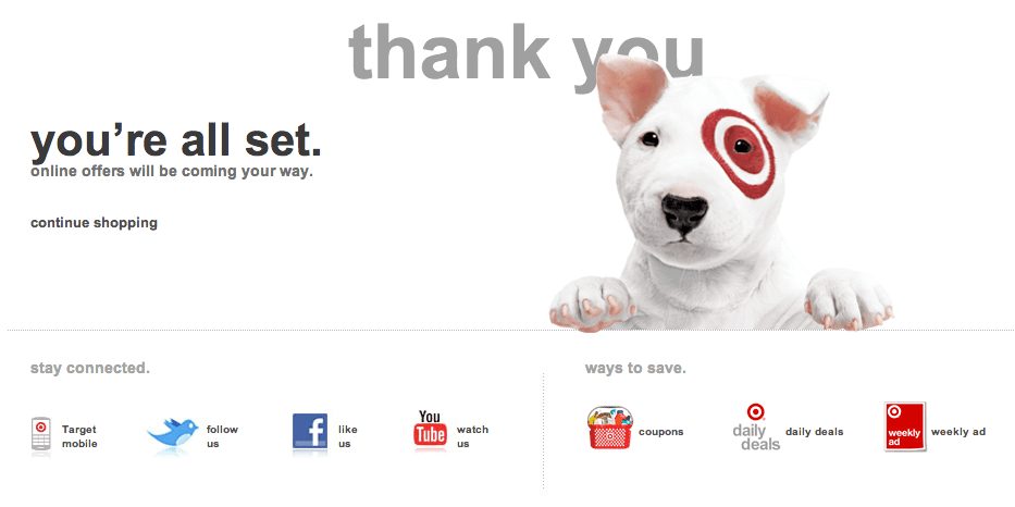
But don’t be afraid to inject some personality and have some fun! Check out this thank you message from Target.
It’s clear, warm, reassuring, and the dog represents an adorable while recognizable mascot. Overall, it’s much more powerful than a plain “Thank you for signing up” message.
Let your creative side shine through on your thank you page. Remember, the lead is already warmed up — take advantage of it!
Don’t lose the navigation bar.
In converting through any CTA, your leads are showing significant interest, which is a good indicator they may be open to exploring additional avenues with your brand. Make it easy for them to further explore your business by keeping the main navigation bar intact on the thank you page.
The navigation bar should help to streamline your website’s user experience, therefore, sending leads away from the site to a separate thank you page will create a feeling of disjointedness. Make the navigation an optimized part of their overall journey with you.
A simple trick with big impact.
Provide options of what to do next.
“Thank you” needn’t be “goodbye.” Tempt these warm leads with other offers and suggestions to keep them engaged with your business. If they downloaded an eBook, ask them to subscribe to your newsletter, direct them to a popular blog post they might enjoy, or suggest a complementary product.
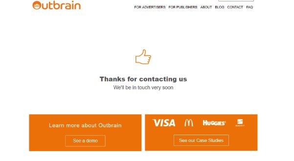
Check out a thank you page we use here at Outbrain. In this example, the user can choose to see a demo or read some case studies. Think of your thank you page as windows of opportunity to continue to engage your leads.
Lift the mood with testimonials
Case studies and testimonials are a powerful content marketing tool. Nearly 60% of people are willing to give their personal information in exchange for case studies. And the thank you page is the perfect place to serve great customer stories to potential customers.
After all, they have already shown an interest in your services and offerings, and reading positive reviews may be just what they need to engage even more.
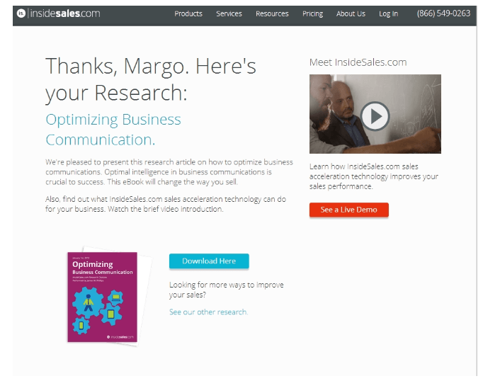
Above, we included a direct link to our case studies, with a few brand logos of well-known customers thrown in for instant recognition.
Video – if you’ve got it, flaunt it.
Video is one of the most engaging content forms. Featured on a landing page, video can boost conversions by 80%. So why not include them on a thank you page where the user is already engaged with your offering?
See how it’s done effectively in the example below. Compared to other CTAs that appear on the page, a video is a soft-sell approach, designed to nurture the lead when they are already primed to pay attention.
Stand out with head-turning visuals.
There are many examples of plain, text-based thank you pages out there that are driving results. But there are a million and one ways you can make your landing page more attractive, inviting, and high-converting.
Given that people recall 65% of visual content after three days, compared to just 10% for text, you’ll probably want to reconsider an overly simplistic approach!
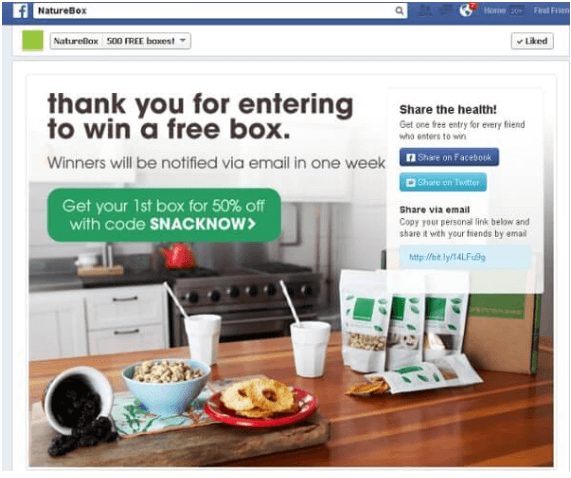
Check out this example from Nature Box:
The graphics are bold, colorful, and totally in line with the brand look and feel. There’s no need to overdo it, but you should definitely consider different ways you can design your thank you page to maximize its impact as a marketing tool.
Make an offer they can’t refuse.
For visitors who have already completed your call to action, why not reward them? Present a special offer, free trial, coupon, or discount directly on the thank you page to really show your appreciation and solicit repeat visits..
The thank you page is a great moment to tempt users with hard-to-resist offers. After all, they converted already, and a special offer might be just the thing to make them a full-blown customer.
In the example above from Nature Box, you can see exactly what we mean. This thank you page combines an eye-grabbing image with a 50% coupon code to take leads over the finish line, all while saying a simple “thank you”.
Thank you is often the last thing that’s said in a conversation, but not in content marketing.
Even though the lead has already clicked through your CTA, now is not the time to rest on your laurels. Quite the opposite — no matter where they are in your funnel, grab every precious opportunity to deepen your connection with customers. And that includes the thank you page.