
8 Tips to Create the Perfect Landing Page

Have you ever clicked on an ad, and then felt completely disappointed by the landing page? I know I have. Once, I clicked on an ad for a pair of shoes. The landing page was a shoe catalog, and the particular shoe that caught my eye was nowhere to be found.
Lesson learned: don’t promise something in your ad that the landing page doesn’t deliver.
Think of it this way – Your ad is a door to your landing page. When the customer enters, you want to make the experience as powerful, appealing and convincing as possible. As a designer at Outbrain, I’m often tasked with creating landing pages. And the first thing I consider is this: what is the goal of the page? Brand awareness, lead generation, registration or something else? Then, I make sure to create a landing page that clearly supports this goal, helped by an ad that is a perfect match for the page.
But that’s just the first step to creating a high-conversion landing page. There’s more to it than that.
Here are my top tips to the perfect landing page:
- Make your message loud and clear
- Above the fold is golden!
- Horizontal forms work best
- Show the love
- Design makes all the difference
- Make it mobile responsive
- Be consistent
- Does your page pass the test?
#1 Make your message loud and clear
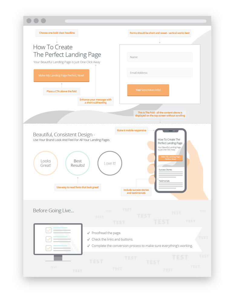
When a user lands on your page, it takes them just 3 seconds to decide if they are interested in your product. You can increase your chances of persuading them by keeping your landing page simple and clear. Don’t clutter the page with too many confusing titles or CTAs. Stick to one clear main slogan and subtitle that get your message across instantly.
#2 Above the fold is golden!
Want to get better performance from your landing page? Place your CTA or registration form above the fold – that is, it should appear at the top part of the page, so the visitor sees it straight away, without needing to scroll down.
If your page is longer than usual, I highly recommended adding more CTA buttons that take the user back to the sign-up form. Another option is to place another form or CTA at the bottom of the page, so the user won’t miss it after scrolling to the end.
If your landing page goal is to sell a product, don’t be shy! Show the product in the second part of the top section so it is easily seen. Other information, like the ‘About’ text or ‘Advantages’, are secondary to the goal, so they can appear lower down on the page.
Here’s another trick: if a page element is clearly straddling the fold, then users will intuitively understand that the page continues below the fold. This will encourage them to scroll down the page!
#3 Horizontal forms work best
In our experience, horizontal forms work better than vertical ones. Horizontal sign up forms are easier to read because they flow with the natural way our eyes scan a page. Also, if your sign up forms are short and sweet, then they are easier to fill out. Displayed horizontally, the user can see what information they need to enter in one glance. If the signup process is quick, they are more likely to convert.
#4 Show the love
Advocacy marketing is when customers recommend or speak favorably about a company online. It’s really the digital form of ‘word-of-mouth’ marketing. When users see that other people are interested in your product, it signals to them that your product is effective/safe/value for money.
It’s worthwhile including advocacy content on your landing page. This might include testimonials, logos of current customers or partners, or statistics that show your product’s popularity, like a number of downloads, or how many satisfied customers you have. Advocacy marketing can help you get more conversions on your landing page.
#5 Design makes all the difference
Your page is your virtual shop window. If it looks good, it will make your brand or product look good too.
The page should speak in the same design language as your brand. If the product is young and fun, then you may want to use images of young people with light, snappy copy that your target audience can relate to.
Make sure the content is placed in the right hierarchy, with appropriate font size and colors so the page is logical and easy to digest. Don’t overdo it – there’s no need to emphasize every second word with an underline or strong colors. Great mockups, cool animations, and emojis can help users engage with your product.
#6 Make it mobile responsive
You don’t know where and when your ad will meet your target audience. It could be on their laptop at work, or on their mobile phone while waiting at the bus stop.
Make your landing page ready for every scenario, and that means making it fit in every screen size – desktop, iPad or tablet, and mobile phone.
#7 Be consistent
Why is consistency so important? Because it helps users recognize your brand, instantly. It also strengthens the brand experience over time and helps users understand what you are all about. And, it looks so much more professional.
All your brand landing pages should have a unified look & feel. That doesn’t mean they all have to look the same. Rather, make sure to use your brand font and colors on all your pages, and keep the set elements the same, such as the footer or form layouts.
#8 Does your page pass the test?
Before publishing the page, it’s important to check that everything works as it should. Get a few different people to proofread the page, so you’ll be sure not to miss any mistakes. Click on all the CTA buttons and complete the registration process to make sure it goes smoothly.
Small mistakes, like an embarrassing typo or broken link, are the type of things that turn people away from your page.
And it’s not just the landing page that needs testing. Don’t forget to check all the emails generated by the landing page in the marketing funnel, and make sure the integration with your CRM system is in order.
Want some inspiration for your next landing page? Check out this cool page, designed to show how advertising on Outbrain’s native platform can help brands and businesses boost their results, and to generate leads for our Amplify product.
What’s the goal for your landing page? Once you’ve defined the goal, every step you take in creating your landing page should get you closer to reaching it. That’s the secret of the perfect landing page!