Effective Landing Page Examples: Inspiring Conversion-Driven Designs


Creating effective landing pages that drive conversions is both an art and a science.
Experts in conversion optimization have offered landing page tips and advice about how to make your pages work for you. We’ve also looked at some of the best practices to keep in mind when creating landing pages. There’s also our recommendations for the top landing page builders you can use to get landing pages up and running fast.
This article is all about inspiration, so we’ve gathered some of the best landing page examples for different types of landing pages and campaign goals. We hope these ideas will trigger your creativity. Combined with the right tools, tactics, and best practices, your landing pages can deliver the conversion results you’re looking for.
Let’s dive right in to the landing page examples to get you inspired:
Minimalistic and Clean Landing Pages
Clean and minimalistic landing pages are the design of choice for brands who want to cultivate a clean-cut image. This style focuses on simplicity and clarity, eliminating distractions and presenting information in an uncluttered and appealing manner. Minimalistic landing pages are effective because they quickly communicate the core message, leading to better user understanding and a higher likelihood of action.
This style of landing page is particularly suitable for products or services that have straightforward value propositions. It allows visitors to quickly grasp the message or offer. They also work great on mobile, as they can more easily fit on small screens and have faster load times.
Here are some guidelines for designing a clean and minimalistic landing page:
- Clear CTA: Place a compelling call-to-action (CTA) that stands out against the page’s simplicity.
- Limited color palette: Stick to a simple color scheme that aligns with your brand.
- Concise copy: Use short, persuasive copy to convey the key benefits and entice action.
- White space: Use white space to create a sense of simplicity and minimalism, and to emphasize key elements.
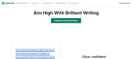
Landing page example: Grammarly
Grammarly, the online writing tool, is the perfect example of a clean, minimalist landing page. The goal of the page is to get customers to sign up for the paid premium tool. The bold headline is clear and simple and stands out against a stark white background. There are few elements to distract or attract the eye, apart from the large, green CTA button right in the middle, perfectly positioned to encourage conversions.
Visual and Interactive Landing Pages
Visual and interactive landing pages do a good job of capturing user attention because they offer an engaging and dynamic experience on the page. Landing pages can feature compelling images, videos, and interactive features to create a strong visual impression on potential customers.
The effectiveness of visual and interactive landing pages lies in their ability to evoke emotions, enhance storytelling, and increase user interactivity. These types of landing pages are particularly suitable for products or services that are more complex, or those that have a highly visual or aesthetic component. With the help of rich and exciting design elements, the user has a more immersive and persuasive experience that encourages conversions.
Take note of these ideas to design a visual and interactive landing page that is truly compelling:
- High-quality visuals: Use images, videos, and graphics of high quality to enrich the visual experience for the target audience.
- Interactive elements: Incorporate interactive elements like sliders, 3D models, or popups to actively engage visitors.
- Clear navigation: Make sure the page is intuitive to navigate, and that the flow of the page supports and enhances the visual experience.
- Performance optimization: Multimedia content can be resource heavy, so remember to optimize these elements for quick loading times to prevent user frustration.
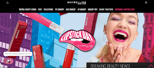
Landing page example: Maybelline
There’s a lot going on in this Maybelline landing page for National Lipstick Day, and it’s all good! The page is visually exciting, providing a real sense of the richness of color in Maybelline lipstick. Also, there are lots of ways to interact, including newsletter signup, popular lipstick products to buy, a chatbot for customer support, and a banner promoting the brand’s pop-up event in New York. This landing page is a visual celebration that is inviting and exciting.
Social Proof and Testimonial-Driven Landing Pages
Landing pages featuring social proof and testimonials rely on the influence of customer experiences and feedback to build trust and credibility, and boost conversion rates. This type of landing page typically showcases positive reviews, testimonials, case studies, and user-generated content to demonstrate the value and reliability of a product or service.
Social proof and testimonial-driven landing pages are based on the psychological principle of social validation. When potential customers see positive feedback from others, they are more inclined to trust the offering and perceive it as a reliable or desirable solution.
Social proof landing pages are extremely effective for new products or services, lesser-known brands, and industries where customer trust plays a significant role. It is also effective for encouraging hesitant prospects who need reassurance before making a purchasing decision.
Here are some of the things to consider when building a landing page that focuses on customer testimonials and social proof:
- Choose testimonials that are specific rather than general: Testimonials should highlight real-world benefits of the product or service, and address common pain points. Stay away from more general compliments about the brand.
- Use different types of content: Include text testimonials, video reviews, and ratings where possible so the page visitors get the message in different ways.
- Visuals: Incorporate images of satisfied customers or real product usage to add authenticity.
- Social badges: Position social proof elements, like industry badges, payment security seals, and Google ratings near the call-to-action where they will be noticed. This helps to reinforce trust and credibility.
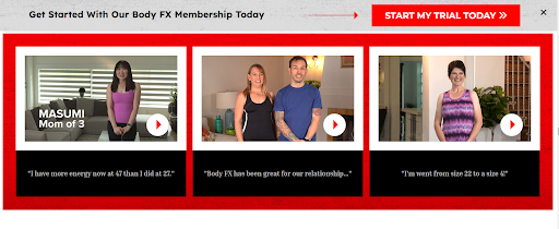
Landing page example: BodyFX
Fitness and weight loss are very personal and powerful drivers for consumers. The BodyFX online fitness brand has a landing page dedicated to testimonials from real-life subscribers. The page features so many authentic customer stories in text, image, and video format that it is hard to deny that the product really seems to work. It is a very convincing example of a social proof-style landing page.
Conversion-Focused Long-Form Landing Pages
Conversion-focused long-form landing pages are designed with the primary goal of driving visitors to take a specific action, such as making a purchase, signing up for a service, or subscribing to a newsletter. These landing pages feature copious amounts of content and information, crafted to convince visitors and drive conversions. The page structure is highly optimized for conversions, employing persuasive elements that are strategically placed to guide visitors through the decision-making process to click and buy.
Long-form landing pages use text, image, and video content to provide comprehensive information, address potential obstacles, and create a sense of urgency, all on a single webpage. By presenting a compelling case and offering relevant benefits, they encourage visitors to act immediately.
Conversion-focused long-form landing pages are useful for B2B products or services that require thorough explanation and justification for the price or commitment. They are also very popular for marketing digital B2C products, which can be purchased directly from the page.
Consider these tips when designing a conversion-focused long-form landing page:
- Clear hierarchy: Organize content with a clear hierarchy, guiding visitors through a logical flow and emphasizing key selling points.
- Engaging headlines: Use attention-grabbing headlines and subheadings to capture visitors’ interest and communicate the value proposition.
- Visual breaks: Incorporate relevant images, icons, and infographics to break up the text and make the page visually appealing.
- Strong CTAs: Place strong and clear CTAs at multiple points throughout the page to prompt action.
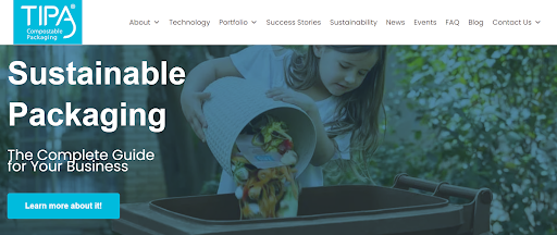
Landing page example: TIPA
Convincing a company to change all their packaging to sustainable alternatives is a big ask. TIPA, the compostable packaging specialist, created a long-form, information-heavy landing page that makes a strong case for it. The landing page features a lot of relevant and useful data and talking points, as well as several CTAs inviting visitors to learn more, explore TIPA’s packaging solutions, or contact a TIPA representative. This is the way long-form landing pages should be done: comprehensive, convincing, and conversion-centric.
Mobile-Optimized Landing Pages
Mobile-optimized landing pages are designed to provide an optimal user experience for visitors accessing the page from their mobile devices. Often, these landing pages are crafted with a mobile-first approach, taking into account smaller screen sizes, touch-based navigation, and the limited attention span of mobile users. This is especially important for brands or businesses whose target audiences spend a lot of their time on mobiles or are likely to search for or interact with the brand via mobile phone.
Mobile-optimized landing pages are built to load quickly, present information concisely, and feature easily accessible call-to-action buttons. With more people browsing the mobile web, most businesses today must make sure their landing pages are mobile-optimized to capture the attention of mobile audiences and give them a positive user experience. This also means optimizing images and reducing unnecessary scripts to improve page loading speed.
Mobile-first landing pages are particularly important for location-based businesses that are trying to capture local audiences in real-time. They are also popular for e-commerce stores and time-sensitive promotions that users are accessing via mobile while on the go.
Mobile-optimized landing pages should incorporate the following guidelines:
- Responsive design: Landing pages should responsively adapt to various mobile screen sizes and orientations.
- Simple navigation: Create a straightforward navigation experience that is suitable for scrolling on mobile. Avoid sophisticated designs that you might choose for desktop landing pages.
- Concise messaging: Use brief and impactful copy to convey the core message and value proposition.
- Tap-friendly CTAs: Make it easy for visitors to convert on mobile by including prominent and easily tappable call-to-action buttons.
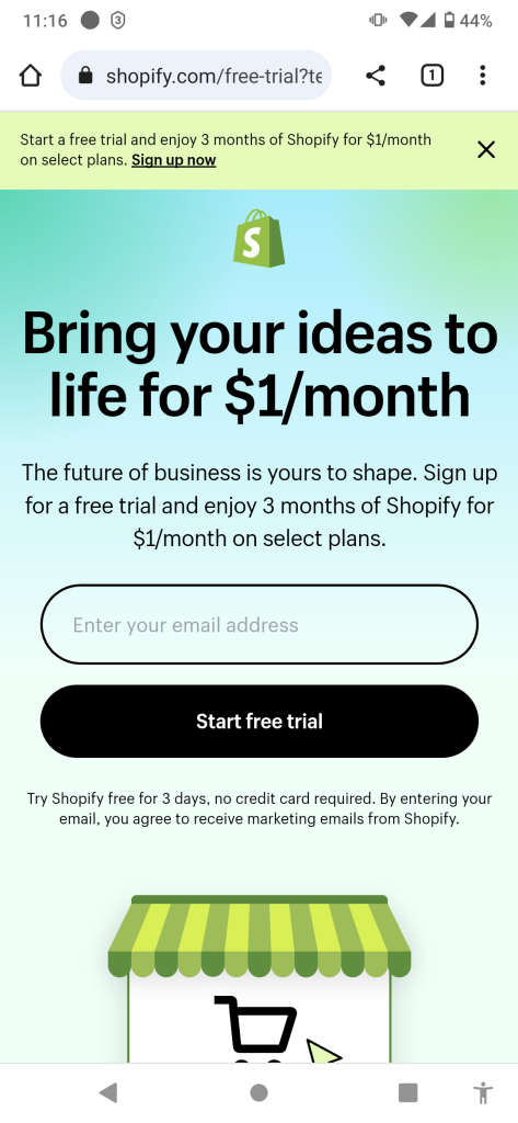
Landing page example: Shopify
E-commerce platform Shopify’s mobile-responsive landing page is on-brand and easy to use. The eye is naturally drawn to the persuasive main message of the headline, and the prominent CTA invites the user to sign up for a free trial by simply entering their email address – all this before even scrolling. A short scroll takes the user to a bunch of logos of top brands that use Shopify, adding a powerful social proof aspect even on the small screen of a mobile device.
Personalized Landing Pages
Personalized landing pages are tailored to cater to the unique preferences, behaviors, and characteristics of individual visitors. They are effective because they offer a relevant and unique experience for each user, increasing engagement and conversion rates.
By addressing specific needs and interests, they make visitors feel valued, which can lead to increased trust and a higher likelihood of conversion. Landing pages can be personalized with the details of each user based on their past interactions with the brand. For example, users who provided their personal information can be targeted with a landing page that features their name or offers a discount or other offer tailored to their preferences.
In other cases, landing pages can feature a survey or quiz, and present compelling targeted offers or products based on the user’s answers.
Personalized landing pages are suitable for businesses with a broad target audience or those offering a wide range of products or services. They are also effective for retargeting campaigns, where past user behavior can be used to customize the content.
Here are some helpful guidelines for creating personalized landing pages:
- Data collection: Gather relevant data through user interactions, past purchases, or preferences, or use the landing page itself to collect data for future use.
- Dynamic content: Use dynamic content blocks to display personalized elements, such as product recommendations or location-specific offers.
- Segmentation: Segment your audience based on specific criteria to ensure relevant content delivery.
- Privacy and consent: Make sure to obtain explicit consent for data usage in accordance with privacy regulations.
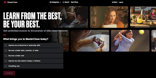
Landing page example: MasterClass
Online learning platform MasterClass’s landing page opens with a quiz asking the visitor about the learning topics they are interested in. A few more questions follow, engaging the visitor further and getting to know their preferences. Finally, the page presents the courses that might interest the visitor and an offer to sign up. This is truly a ‘masterclass’ in how to use personalization on landing pages.
E-Commerce Product Landing Pages
The purpose of e-commerce product landing pages is to showcase specific products to potential customers and drive online sales. Online stores that sell a wide range of products can use landing pages to present certain product categories and target relevant audiences who are likely to be interested in purchasing. For example, a landing page featuring children’s clothing is suitable for parents, while a landing page featuring discounted running shoes can be targeted to people interested in fitness.
E-commerce product landing pages are optimized to provide useful information about the product, as well as images, videos, and other elements to tempt the viewer to convert and buy. Landing pages that address customer pain points and objections, and offer an easy, frictionless purchase process, will have the most impact.
This type of landing page is appropriate for online stores and businesses that offer a wide range of products, as it allows them to focus on individual items and tailor the content to suit the target audience’s interests.
A great-looking and persuasive e-commerce product landing page will follow these broad guidelines:
- High-quality product images: Use high-resolution images and multiple views to showcase the product from various angles.
- Product descriptions: Include enticing product descriptions that highlight key features and important details.
- Clear pricing and offers: Clearly present pricing, discounts, and any special offers to entice visitors to buy.
- Prominent add-to-cart button: Make sure that the “Buy now” buttons stand out and are easy to access.
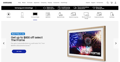
Landing page example: Samsung
Samsung’s web page for TV and home theater products is a great example of a dynamic e-commerce landing page. The showcased products change from time to time when new sales and offers are available. Each product has the price displayed very prominently, as well as monthly pricing for customers who want financing assistance. The emphasis is not just on the product but also on the value of the special offer, making it all the more enticing to customers.
Event Registration Landing Pages
Event registration landing pages are designed to entice potential attendees to register for an upcoming event. These landing pages typically feature the details about the event, and may also include images, videos, or other elements to generate buzz and excitement. Of course, the page includes the registration form, where people can sign up to attend the event.
Event registration landing pages must communicate the value and benefits of attending the event, and address any potential questions. Including a short FAQ section is a good tactic for this. The registration process should be seamless and straightforward so that signing up to attend is as simple as possible and friction-free.
Landing pages for event registration are used by businesses or organizations hosting conferences, webinars, workshops, seminars, and other events. Companies that host regular or recurring events can consider creating a template for their event landing page. When a new event is coming up, there is no need to build a new page and registration process; simply swap the information and images in the template, and the landing page is ready to go.
Here are the top points to consider to create effective event registration landing pages:
- Event details & description: Clearly state the event’s date, time, and location. Include a description detailing the agenda and activities, and what attendees can expect.
- Speaker information: If there are featured speakers, provide information about their expertise and background to build buzz and credibility.
- Registration form: Include a user-friendly registration form with minimal required fields to reduce friction and increase completion rates. Implement conversion tracking so you can measure the success of the landing page in registering attendees.
- Early bird discounts: If it is a paid event, encourage registration with offers or discounts for early signups.
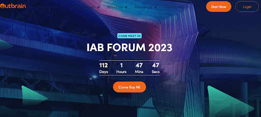
Landing page example: Outbrain
At Outbrain, we use a template format for event registration landing pages featuring the event name in a bold headline, with a countdown timer centrally placed to create a sense of context and urgency. The graphics change to match the event, but the CTA button in standout orange is the prominent feature, encouraging visitors to click and sign up in the embedded registration form.
App Download Landing Pages
The primary purpose of landing pages for app downloads is to promote an app, provide enticing information about the app to the visitor, and encourage them to convert by downloading and installing the app. App download landing pages are a dedicated space to communicate the app’s key features, benefits, and unique selling points. However, the CTA must be crystal clear and unwavering: visit the app store and download.
App download landing pages are particularly effective when promoting a new mobile app, launching app updates, or running targeted app marketing campaigns. They are also useful as an ongoing tool for app promotion and as part of continual efforts to increase the user base. Any business or company that owns an app can and should use a landing page to encourage downloads – this includes apps for business, gaming, finance, fitness, dating, and every other app category.
Try these guidelines to create an app download landing page that works well for your app:
- CTAs for app stores: Most important is to include direct links to the app page on the App Store and/or Play Store. The app store badges should be clearly placed above the fold.
- Engaging visuals: Use high-quality screenshots, videos, app previews, or other design elements to demonstrate the app’s user interface and functionality.
- Concise messaging: Keep the copy clear, concise, and benefit-driven, highlighting the app’s key features and how it enhances users’ lives.
- Mobile optimization: Ensure the landing page is fully responsive and optimized for a seamless user experience across different mobile devices. This is essential for app-focused landing pages.
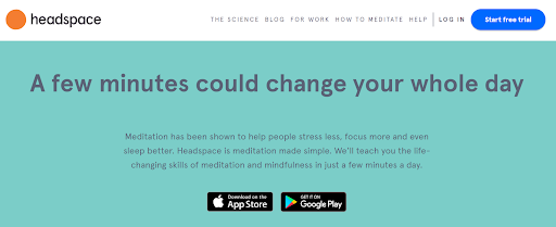
Landing page example: Headspace
Headspace, the popular meditation app, is the perfect example of powerful messaging on its app download landing page. The headline is clear and enticing, explaining the key benefit of the app in just a few words, and it stands out beautifully against the solid yet calming background. The app store badges feature prominently just above the fold, and also stand out boldly with the black-on-green effect.
Call-to-Action Design and Placement
The call-to-action (CTA) buttons are possibly the most critical element of landing pages, and much care and consideration should go into their placement, color, size, and wording. Here are some guidelines for each aspect to make CTAs more effective and encourage conversions.
Placement:
- Above the fold: Position the CTA button prominently in the top section of the landing page so that it is visible without scrolling.
- Near key information: Place the CTA button close to important information, such as the value proposition or product details, to reinforce the message.
Color:
- High contrast: Use a color that stands out against the background to make the CTA button easily noticeable.
- Brand alignment: Align the CTA button color with your brand’s primary color to maintain consistency and reinforce brand identity.
Size:
- Large and tappable: Make the CTA button large enough to be easily tappable on mobile devices, but not overwhelming in the overall design.
- Relative to importance: Size the CTA button relative to its importance; the most critical action should have the most prominent button.
Wording:
- Action-oriented: Use clear and action-oriented language on the CTA button, such as “Buy Now,” “Sign Up,” or “Get Started.”
- Benefit driven: Incorporate benefits or incentives where possible, such as “Get 20% Off” or “Download Your Free E-book.”
Try to keep the number of CTAs to a minimum to avoid overwhelming visitors and ensure a clear path to conversion. Surround the CTA button with ample white space to make it visually distinct and enhance click-through rates. Finally, be sure to conduct A/B testing with different colors, wording, and placements to identify the most effective combination.
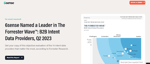
Landing page example: CTA placement
Sales & marketing platform 6sense demonstrate how to craft and place CTAs in their e-book download landing page. The B2B design is simple and clear, and the bold black CTA stands out as soon as the page opens, inviting visitors to “Read the Report”. The placement of a right-pointing arrow on the CTA button is a clever touch, adding a sense of movement and action. The CTA appears three times on the page in strategic locations during scrolling. It mixes nicely with another CTA in orange inviting the visitor to book a demo of 6sense’s product. This shows how two different CTAs with different goals can coexist effectively on one landing page.
Build It Right, and the Conversions Will Come…
The landing page examples above provide a wide-ranging showcase of what an effective, well-designed, and properly thought-out landing page can look like. Of course, the possibilities of design, navigation, and messaging are as varied as the audience and objectives of the landing page. Stay true and consistent to your brand, gain a deep understanding of the audience, focus on building an irresistible path to conversion, and you’ll be succeeding with your landing pages in no time.