7 Inspiring Infographic Examples 2025


Ever wondered how to make dry data come to life? Enter the world of infographics! An infographic is a visual representation of information or data that explains complex concepts quickly and clearly. As you can see in the infographic examples below, by combining images, charts, and a little text, infographics make information more accessible and engaging.
Infographics are a major player in marketing and social media, with images increasing clicks by 65%. Consider what is more appealing: plain text on a blank page or vibrant pictures that make the data easier to grasp? You know the answer…
How to Create Infographics
Creating infographics is easier than you think, especially with the right tools. Platforms like Canva, Adobe Express, and Infogram offer you extensive features and capabilities to design professional-quality infographics. They even include templates you can pick and customize any way you want. According to Visme, “In a recent study, psychologists found that 55% of readers preferred messaging that included the use of color compared to messaging that only used black and white.” While the design and branding are important, following the key steps below helps to ensure that the information you want to share doesn’t get swallowed by the design.
5 Key Steps to Create an Infographic
Step 1: Research your audience
Start by understanding what is your infographic inspiration and who you’re designing the infographic for. Tailor your infographic to meet the interests and needs of your target audience.
Step 2: Collect data
Gather accurate, relevant data to support your visual story. Make sure your information is up-to-date.
Step 3: Design
Canva or Adobe Express are beginner-friendly design tools, which means you don’t need any technical skills to get started. As you choose a template or design for your infographic, focus on creating a logical flow and visually appealing layout that seamlessly guides the viewer through the information.
Step 4: Choose colors and fonts
Select color schemes and fonts that enhance readability and align with your branding.
Step 5: Ensure readability
Use clear, concise text and make sure your visuals don’t overpower the information. The goal is to make complex information simple and engaging.
7 Infographic Examples: Types and Designs
Infographics come in all shapes and sizes, each with its unique way of making data visually captivating. Let’s explore some best infographic examples of 2024 from which you can take inspiration when you design your own.
Statistical Infographics
These infographics present statistical data visually, making complex numbers easier to grasp. For example, a statistical infographic on global internet usage like the one below shows the percentage of users per region using the internet, who are active on social media, and more.
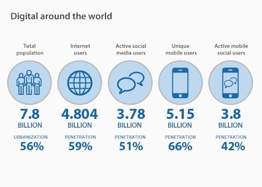
Source: VPN Mentor
Informational infographics
Informational infographics share a lot of information or data in a way that is visually appealing and easier to understand. The example below is an infographic that is information rich, yet it doesn’t feel dense or text heavy.

Source: Venngage
Timeline infographics
Timeline infographics illustrate events over a specific period. They are a much more interesting and engaging way to present information than a simple list of dates and events. In the example below, the infographic presents evolution of native advertising and showcase key milestones and advancements.
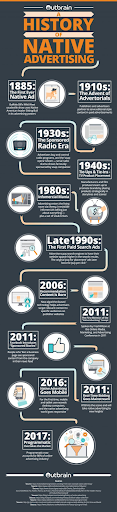
Source: Outbrain
Process infographics
Process infographics show the steps of a process, like the one below explaining the recycling stages from collection to processing. Instead of describing a process in written format, which would be long and cumbersome, a process infographic is far more digestible and interesting.
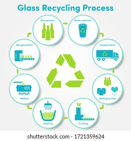
Source: Shutterstock
Geographic infographics
Geographic infographics use maps to present location-based data – for example, showing global warming effects across different continents. By using a map, the geographic information is instantly conveyed, which is very difficult to do with words alone.

Source: UCAR
Comparison infographics
Comparison infographics present multiple items or ideas side by side, comparing the differences or changes. The infographics example below shows the features of iPhone models over the years, presenting the journey of the iPhone in a visually fun and exciting way.
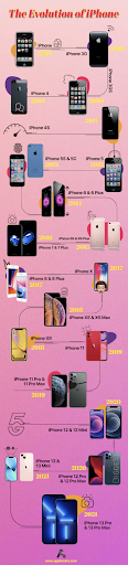
Source: Applesutra
Hierarchical infographics
Hierarchical infographics present information in order of importance or rank. It is an excellent format for illustrating an organizational structure or a power structure, such as a corporate or government organization. It is also suitable for conceptual hierarchies, showcasing the levels in the hierarchy in a clear and intuitive way. Here’s an example of a hierarchical infographic:
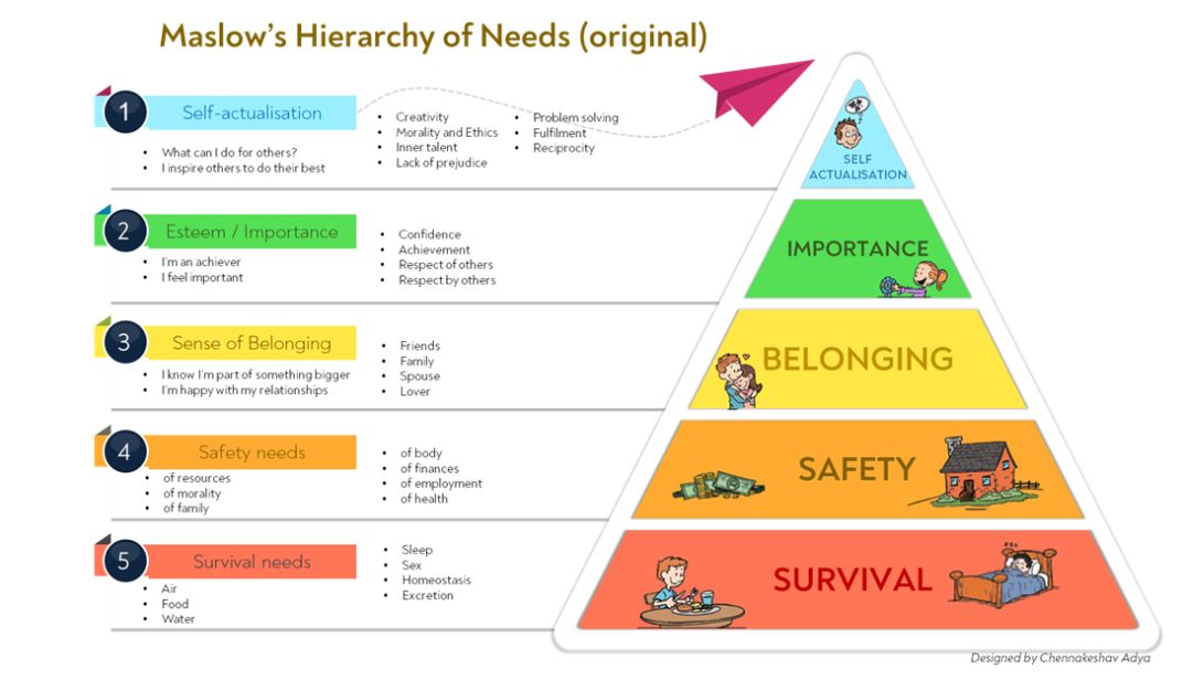
Source: London Business School StartHub
Why Use Infographics?
Infographics offer multiple benefits for data visualization:
- They simplify complex information.
- They enhance audience engagement.
- They are easy to share on social media.
- They improve data retention and recall.
- They are visually appealing and draw attention.
By harnessing the power of infographics, you can transform how your audience interacts with your data, making it not only informative but also delightful.
Tips for creating infographics
- Highlight key takeaways: Use visual cues like bold text or contrasting colors to emphasize the most important points. This helps viewers quickly grasp the essential information.
- Share across channels: Don’t let your infographic go unnoticed. Maximize its reach by sharing it on social media, blogs, and websites. The more places it appears, the bigger its impact.
- Use engaging headlines: Craft headlines that grab attention and convey the infographic’s main message. A strong headline can draw viewers in and entice them to explore further.
- Incorporate icons and images: Enhance your infographic with icons and images that support the content. Visual elements can make complex information easier to understand and more appealing.
- Keep it concise: Avoid clutter by keeping your infographic focused and to the point. Too much information can overwhelm your audience.
Make Your Data Memorable with Infographics
Infographics are more than just pretty pictures – they’re your secret weapon for turning dry, complex data into fun, visually engaging stories. Imagine your audience not just understanding but enjoying your content! Whether you’re showcasing global internet usage, detailing the benefits of a balanced diet, or illustrating the evolution of technology, the right infographic can make your information pop. And the best part? With tools like Canva, Adobe Express, and Infogram, creating stunning infographics is a breeze.
So go ahead, dive into the world of infographics, and start transforming your content today. Your audience will thank you for it – and you might even have a little fun along the way!
FAQ
How can you create your own infographics?
Start by gathering accurate and relevant data that supports your message. Build a layout that guides viewers through the information. Use visuals like icons, charts, and images to highlight key points and make the data more digestible.
What is the best tool to create an infographic?
Canva, Adobe Express, and Infogram are top choices. Their user-friendly interfaces and extensive features make them ideal for crafting professional-quality infographics.
What is the most effective kind of infographic?
The effectiveness of an infographic depends on its purpose. Statistical and informational infographics are highly effective for presenting data.
What is the best topic for an infographic?
Topics that summarize or simplify complex information or data, such as health benefits, technological advancements, or historical timelines, make great infographics. Infographics are also useful for topics that are complicated to explain in words alone, but may be easier to understand with visual aids or illustrations.
What are the three most important elements of an infographic?
An three most important elements for an effective infographic are:
- Clear visuals
- Concise text
- Logical structure
These ensure your infographic delivers information effectively and makes it easy for your audience to grasp.