How to Create High Performing CTAs


Quick Read
Tempt your audience to click on your calls-to-action with these tips:
- Make the CTA stand out
- Surround the CTA with supporting messages
- Personalize the CTA, if you can
- Make the CTA experience as easy as possible
- Give your CTA a sense of urgency
- Make sure your CTAs are optimized for mobile
- Space out your CTAs smartly
High-Performing CTAs: Every Marketer’s Goal
As a performance marketer, the purpose of your web page, email, or popup is not just to look good (although it should). The goal is generating conversions, or in other words, convincing users to take a particular action. For that, you need CTAs (calls-to-action). And they must be high-performing CTAs to get the clicks.
A high-performing CTA includes a combination of elements, such as messaging, color, position on page, and more, working together to drive the action that leads to conversions.
The action you want users to take will depend on your goal, such as lead generation, brand awareness, event promotion, or product sales.
What are some examples of an ‘action’ that leads to conversion?
- Click through to a landing page
- Sign up for a newsletter
- Share something on social media
- Register for an event
- Book a demo or sales call
- Click “Buy” to purchase
- And more
Once you’ve established your goal, you can start creating effective CTAs to support that goal.
There’s loads to cover, so let’s kick off the 7 essential tips to create high-performing CTAs that bring the clicks.
Tips to Create High-Performing CTAs (With Examples)
Make the CTA stand out
A CTA is designed to spur the viewer to action – so you can’t afford to be wishy-washy. Use bright colors, borders, bold fonts, and interactivity to catch the user’s eye as they browse the page. The CTA must be clear, both visually, and in specifying the action the viewer should take.
High-performing CTA: Outbrain Brand Studio
Check out this high-performing CTA example from the Outbrain Brand Studio web page – it’s a rotating circle that instantly catches the eye of the user. Inside the circle is an orange button boldly stating “LET’S TALK”. The message is simple and clear, but at the same time, the element of movement is completely captivating, almost willing the user to bring the mouse into the circle to click.
Surround the CTA with supporting messages
The CTA is the ultimate goal of any digital marketing asset. But it’s not the only thing to appear on the screen. Use other page elements to encourage the viewer to interact with the CTA. This can be done by optimizing the design to make the CTA the central focus, while including other textual and visual elements to strengthen its impact.
High-performing CTA: Neuroblastoma Australia
The example below is from an email sent out to newsletter subscribers of cancer charity Neuroblastoma Australia. The purpose of the CTA is to get people to register for the Run2Care fundraising event, as evident in the CTA message to “Register Now for This Offer”. Surrounding the bold red CTA button is supporting information to convince the reader to click and register. For instance, there is a discount offer to entice people to sign up before a certain date, and a short paragraph below the CTA explains how the funds raised will contribute to combatting cancer. A CTA never stands alone; it must work in the context of the marketing asset. This is a solid example of how to make that happen.

If you can, personalize the CTA
Personalized CTAs are the most high-performing CTA of all. According to a study by HubSpot, personalized CTAs get 202% higher conversion rates than regular CTAs. Combined with great placement, design, and context, personalization should be used wherever possible.
High-performing CTA: Medium
Medium, the online publishing platform, regularly sends out marketing emails to subscribers suggesting new authors or blog topics that might interest them, based on their previous activity on the site. The marketers at Medium do something quite genius with their CTAs in an email sent to non-paying subscribers. Alongside the user’s handle at the top of the email body, there is a simple, text-based CTA in contrasting green font inviting the reader to “Become a member”. Why does such a non-obtrusive CTA work so well? Because non-paying subscribers have limited access to content, and the email includes links to enticing content that they can only read if they become a member. The email presents the recipient with personalized reasons to click and convert at the exact right time, and that’s what makes the CTA so convincing.

Make the CTA as easy as possible
If a CTA is hard work, it won’t work. That’s why any good call to action should make it easy for the user to follow through. This includes the wording, design, and location of the CTA elements on the screen. If the CTA is part of a form that requires the user to enter their information, then take extra care to make the process short and quick. One study showed that reducing a form from four fields to three can increase the conversion rate by nearly 50%.
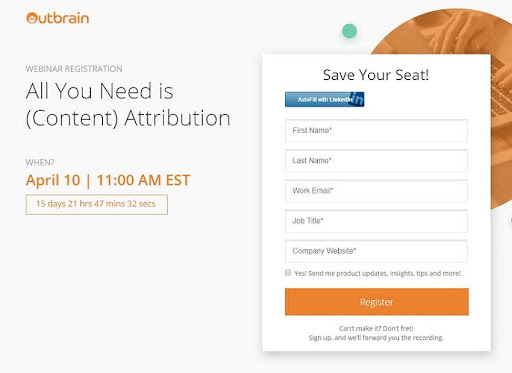
High-performing CTA: Outbrain Webinar
Promoting a webinar, Outbrain published a landing page that included a registration form and CTA to sign up. The page includes all the relevant information about the event, with the CTA standing out as a large, clear orange button. But take a closer look – at the top of the registration form, the user is given the option to autofill the fields with their LinkedIn information via another CTA button in contrasting blue. Just at the moment when the user is deciding whether or not to start the signup process, here comes a CTA that makes it so much easier and quicker. Whenever you can, try to add helpful elements that will make completing your CTA a no-brainer.
Give your CTA a sense of urgency
A surefire way to get people to act is to give them a reason to act. And if that reason is wrapped in a sense of urgency, then it is more likely to work. You can create urgency by limiting an offer by time, or by the number of available offers – even just adding high-pressure words and phrases like “Now!” or “Today” can have an increased effect.
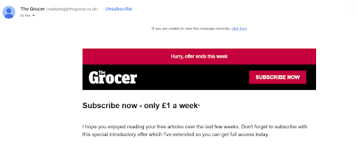
High-performing CTA: The Grocer
The Grocer is a UK-based news outlet for the grocery industry that has been in publication for over 160 years! In an email sent to subscribers of the free newsletter, a bold red CTA is featured at the top encouraging recipients to “Subscribe Now” and receive a limited-time discount for a paid subscription. The CTA is accompanied by headlines above and below that include words like “hurry”, “don’t forget”, and “get full access today”, all of which communicate a heightened sense of urgency.
Optimize your CTAs for mobile
According to Google, conversion rates on mobile are lower than desktop. That means your CTAs have to work harder on mobile to perform well. For a mobile CTA to be effective, it must have visual and UX elements that make it clear and easy on a smaller mobile format. The main CTA should display above the fold so there is no need to scroll, and the button must be big enough to work properly on a touchscreen.
On the other hand, the CTA must not be too overpowering – there’s not a lot of room on the average mobile screen. Plus, Google claims that when the number of elements on a mobile web page increases, the conversion rate drops. When it comes to CTA design on mobile, the formula is definitely KISS (keep it simple, stupid).
High-performing CTA: HubSpot
The mobile CTA by Hubspot below is a great example of clean, clear, and simple. The brand colors are calm and inviting, yet at the same time, the orange CTA button for “Get a demo” is bold enough to draw the eye, with contrasting white font to make it stand out. Just below, there is another CTA with inverse colors, inviting DIY users to get started for free. Note that the CTA buttons span the width of the mobile screen, so they are hard to miss. Plus, the overall mobile page is not cluttered or cramped. It strikes just the right balance of headline, copy, and CTAs.

Space your CTAs smartly
A good CTA drives the user to want to act. There is nothing attractive about nagging your customers. One CTA probably won’t be enough for an average web page. On the other hand, if there are CTAs everywhere, it will come across as desperate and that is never a good look. You might want to include two or more CTAs on a web page, but make sure they fit logically with the flow of the content, and don’t put them too close together. Rather, give the user some breathing space before hitting them with another CTA.
High-performing CTA: Shopify
The Shopify e-commerce platform has done a great job on its homepage CTAs. The main element of the page is the video background, which creates a busy feel. In contrast, a clean white CTA stands out neatly against the black strip at the top of the page. Once the user scrolls just a little, another white CTA appears in the line of sight to the left of the page, reinforcing the urge to click. Of course, including the word “free” in the CTA makes the offer all the more attractive.
Are Your CTAs High Performing?
So you’ve done everything you can to create high-performing CTAs. But how do you know whether they are working? By A/B testing them of course. Check out some essential tips for A/B testing here. In the meantime, use the ideas and examples above to create CTAs that your users won’t be able to resist.
FAQ
What is a CTA?
A CTA, or “call to action”, is an element placed on a web page that prompts the user to take a particular action online, such as buying an item, booking a sales call, downloading a guide, or submitting a registration form.
The CTA is a link that appears as a button or sometimes as a text-based link. It may lead to a landing page, product page, or any web page that takes the user to the next stage of the interaction.
What is an effective CTA?
An effective CTA is a CTA that achieves its specific goal. For example, a CTA for a webinar page will get a lot of sign-ups, a CTA on an Amazon product page will get a lot of sales, etc.
However, the CTA doesn’t work alone. For example, a CTA promoting a webinar may be very effective and get a lot of clicks. But if the registration form is long and complicated, this may prevent people from signing up. CTAs should be considered in terms of the final conversion to determine what impact they have on the buyer’s journey.
What is a good CTA rate?
The goal of a CTA is to encourage users to click through, so the most important metric for a CTA is click-through rate or CTR. A good CTR for CTAs varies across industries, however, the average CTR hovers around 1.9%. B2C industries, such as travel, tend to get higher CTRs, whereas B2B CTRs are often lower on average.