5 Worst Mistakes You are Making with Website Pop-Ups


Too much of something is never a good thing, especially in digital marketing.
This is the essence of the argument against pop-ups. As with banner ads (which lead to the dreaded banner blindness), pop-ups are ‘ubiquitous’ and ‘annoying’. As the claim goes, they just seem to ‘pop up’ everywhere. Because of pop-ups, website visitors have to close a few windows before they even get to the content they want to see in the first place.
Yet, the true story is not as simple as that.
According to SleekNote, the average pop-up conversion rate is 4.13%.
Compare that to Google display ads (avg. conversion rate of 0.57%), or email marketing (avg. conversion rate of around 3%).
Considered in context, pop-ups perform on par with many other accepted digital marketing tactics. It seems that pop-ups have (unfairly!) taken quite a bad rap.
Could this be a case of “a bad worker always blames their tools”?
Perhaps marketers are making mistakes with pop-ups, antagonizing their audiences rather than enticing them.
Pop-ups can still be a solid conversion machine – as long as they are in the right marketers’ hands. So how can you make pop-ups work for you, instead of against you? Try to avoid these common mistakes:
- Bad timing
- Lack of context
- Unconvincing copy
- No valuable offer
- No testing
Let’s walk through them one by one.
Pop-Up Mistake #1: Bad Timing
Many things may annoy website visitors, but getting blasted with an offer before they even get a chance to settle in and see the website is probably the worst.
If you put yourself in the shoes of a random website visitor, you’ve probably been there before. You search for a certain topic of interest and click on the link. Before you can even read the first few words, you are interrupted by a pop-up inviting your to subscribe to a newsletter. Even worse, a slider covering the whole screen – like this one.

This slider swooped in a couple of seconds after I landed on one marketing expert’s website. Less than a minute after that, I also got a slightly too intrusive pop-up on top of the existing pop-up.
How can website visitors sign up if they can’t see what they are signing up for?
Displaying pop-ups as soon as people land on your website, especially in the form of sliders that cover the whole screen is annoying, pushy, and often inefficient. Digital marketing, especially content marketing, should fit in with the user’s browsing experience naturally and unobtrusively.
So what should you do instead? Allow people to land on the page and spend some time on it before you hit them with an offer to sign up or buy something. Now, nailing down the right time is a bit trickier – there is no golden mean that fits every website.
The first step to determining your perfect pop-up timing is to analyze the time visitors spend on your page. You can do that in Google Analytics. According to Wisepops, the best pop-up timing is about 50%-60% of the average time on the page.
Another metric that can determine the perfect pop-up timing is to track visitors’ level of engagement.
Readers who scroll below the fold tend to spend more time down the page than they do at the top. This implies they are engaging with your content, which boosts the chances that they will read your pop-up offer and accept it.
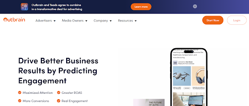
Here’s a trick to completely sidestep the challenge of timing – deploy a sticky bar that sits at the top or the bottom of the screen the entire time, without interrupting the user experience. Here’s an example of a sticky pop-up at the top of Outbrain’s home page, with a gentle invitation to “Learn more”:
Finally, there are other ways to get the timing right – triggering pop-ups by behaviors such as exit-intent, inactivity on the page, etc. This brings us to the next mistake marketers often make.
Pop-Up Mistake #2: Lack of Context
Lack of context is the grave sin of mismatching the pop-up and the page content, the user’s search intent, or online behavior.
Imagine that you sell sports shoes online. A website visitor lands on your blog post about “5 Tips for Maintaining Your Running Shoes.” The right move for your pop-up is to offer them a subscription to your newsletter or a discount for a shoe maintenance product. The wrong thing would be to offer free shipping for your products.
Sure, free shipping is great, but it’s not what the visitor is looking for in this particular situation. They want tips on sneaker maintenance, which implies that they already own sports shoes. In that case, offer them a newsletter subscription and add them to your email list so they can stay up-to-date about future discounts and deals. Or, suggest a product they might need based on their search behavior.
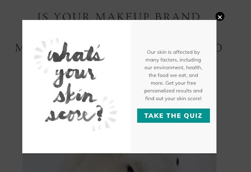
Pop-ups with a quiz are a powerful way to engage website visitors and establish trust. Use the quiz format to present your expertise and a solution to the visitor’s problem. (Also, quizzes are personal and fun!) For example, a person landing on a cosmetics site is likely to be curious about their skin type. Use a pop-up to present a “skin type quiz”, and offer their results in exchange for their email address. Another option is to set the results to take them directly to a personalized set of products.
So, always make sure your pop-up window offer is connected to the user’s search intent and their behavior on the page.
This is also critical when a visitor starts to leave your website. Around 95% of visitors who abandon your site never come back. Similarly, 70.19% of online shoppers abandon their shopping carts, without making the final purchase. However, according to OptinMonster, by triggering pop-ups to respond to a user’s exit intent, you can convert an additional 2-4% of visitors into email subscribers or buyers.
Pop-Up Mistake #3: Unconvincing Copy
Once your pop-up shows up at the right place, at the right time, it also has to say the right thing. One of the greatest challenges for any marketer is figuring out what works better. A simple offer and call to action? Or a pop-up with an image and flashy copy that includes the latest pop-culture reference?
In general, it can be both. The common denominator of each option is that it has to be a clear, straightforward message.
Sumo conducted research analyzing an astounding two billion pop-ups, and one of their surprising conclusions was that simple copies were sometimes more effective than elaborate offers.
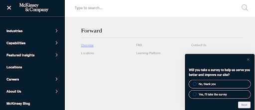
Take a look at the pop-up at the bottom right of the McKinsey & Company website, asking visitors to participate in a survey. It’s simple, clear, polite, and powerful. No wishy-washy words or begging tone, and it really works.
Simple and clear doesn’t have to be boring. Take a look at the pop-up below for an upcoming webinar from the folks at IT Care Center. While the message of the pop-up is clear, as is the CTA, the language and design have personality and color, making it an inviting and interesting experience.

Whether you’re going to get creative or keep it simple, a convincing pop-up window includes:
- Clear offer
- Value explanation
- Call to action
Now let’s talk in more detail about the importance of value.
Pop-Up Mistake #4: No Valuable Offer
Value. This is the backbone of any digital marketing activity, including pop-ups.
If you are not providing value to the audience, you are simply not doing your job.
Especially if you are asking the user to provide their contact information, you must provide a strong added value, or you won’t get the results.
When it comes to pop-up offers, many marketers forget that buzzwords such as “discount,” “sale” or “free” are overdone, and don’t necessarily impress people anymore. For example, offering a visitor to download a batch of templates or an e-book is great, but pointing out that it’s FREE is not exactly the product’s value. There are thousands of websites offering free templates and e-books. The catch? Your templates and e-books are better, and more valuable. You just need to communicate why.
If you want to create a valuable offer, either have a (great!) giveaway or discount, or make your incentive unique in some other way.
Pop-Up Mistake #5: No Testing
What works for one pop-up or campaign don’t necessarily work for another. Plenty of marketers google tips on “how to create a high-converting pop-up”, only to get lackluster results and wonder where things went wrong.
You can determine the best placement, timing, and offer for your pop-ups by continually tracking your website visitors’ behavior and engagement, and fine-tuning your pop-ups according to the results.
Another excellent way to nail down what works and what doesn’t is to do A/B testing. Create several pop-up variations with different timings and triggers, and track which one drives the best results. Then, you can use this information to refine your future pop-up campaigns.
Proper Pop-Ups Perform, We Promise!
Pop-ups are not dead, and they are not the devil. In fact, pop-ups get comparable conversion rates to other popular digital marketing activities. So what ruins the potential of pop-ups and drives online users a little bit crazy? Pop-ups that are full of mistakes, whether it be bad placement, annoying timing, frequency overload, or copy that doesn’t hit the mark.
Pop-ups are an incredibly versatile, flexible, and creative marketing tool, if you can avoid the mistakes above. So make sure to craft your pop-ups correctly, and get the most from your website traffic.