
Mobile First Indexing Guide: Myths & Tips


Mobile devices have a huge impact on our daily routine. We wake up, grab our smartphones, and hardly put them aside during the day. Constantly online, people can communicate, work, and search for the necessary information on the move.
Considering a large number of mobile users, this audience has been a major concern for experienced marketers for a long time now. However, it’s not just marketers who develop their strategies according to trends. Google developers also consider the importance of mobile when updating their algorithms.
2017 was the year when mobile-first indexing was announced and widely discussed in the SEO community. Since then, Google developers have taken efforts to allay all the myths and concerns about the impact of mobile-first indexing on rankings. And still, I’ve repeatedly faced confusion and misunderstanding on what mobile-first indexing is.
In this article, I’ll tell you about the most popular myths around mobile-first indexing. You’ll also discover what you should do to prepare for the transition.
What is mobile-first indexing?
Mobile-first indexing is primarily using the mobile version of the site for indexing and creating Google search results. Here’s how it’s described on Google Developers: ‘Mobile-first indexing means Google will predominantly use the mobile version of the content for indexing and ranking. Historically, the index primarily used the desktop version of a page’s content when evaluating the relevance of a page to a user’s query. Since the majority of users now access Google via a mobile device, the index will primarily use the mobile version of a page’s content going forward. We aren’t creating a separate mobile-first index. We continue to use only one index.’
When, in March 2017, Google announced they were starting with mobile-first indexing, they didn’t mean they’d stop indexing desktop sites. So, if you have only the desktop version of your site, it will still get indexed. However, this isn’t the only concern about the new approach to indexing. Here are the most popular myths caused by the mobile-first indexing announcement.
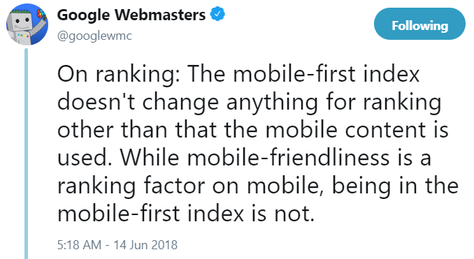
Myth 1: Mobile-first indexing impacts rankings directly
Mobile-first indexing doesn’t change the overall rankings. Even if you switch to mobile-first indexing, you can see it doesn’t influence your site’s positions on Google search results negatively.
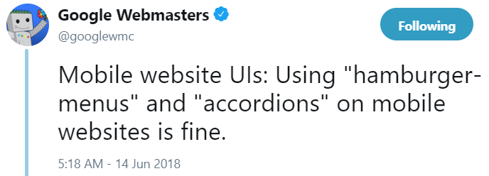
Myth 2: Expandable content isn’t weighted high on mobile
The truth is that expandable content hidden in hamburger menus and tabs isn’t really weighted high when desktop sites are being indexed. However, according to Gary Illyes from Google, when it comes to mobile websites, crawlers give such content full weight. They do this because expandable content makes sense only on mobile.
Myth 3: Mobile-friendliness and mobile-first indexing are the same
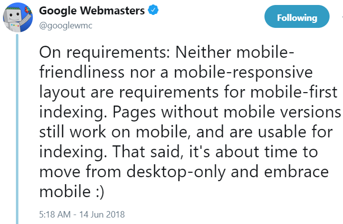
These two concepts, in fact, have nothing to do with each other. Mobile-friendliness is an important ranking factor for mobile, but it has nothing in common with mobile-first indexing. Moreover, sites that aren’t mobile-friendly have also been moved to mobile-first indexing.
So, if Google notified you that the transition is complete, it doesn’t mean your site is mobile-friendly.
Mobile-first indexing tips
In December 2018, Google announced that over half of the pages ranking in search results already moved to mobile-first indexing. This means that if your site hasn’t moved to it yet, the transition will happen very soon. After it moves, crawlers won’t consider your desktop content anymore. You’ll need to re-optimize your mobile version. So, if you have a separate mobile website and want Google to evaluate it properly, it’s time to check the following aspects:
Hreflang links
Hreflang attributes are used to tell Google you’re using different languages for different pages. They help search engines provide users searching in a specific language with relevant results. If you use ‘rel=hreflang’ on the mobile version of your site, make sure you separate it from the desktop one. In other words, your mobile page’s hreflang should match up with mobile URL, while the desktop page’s hreflang should match up with desktop URL.
Metadata
Your meta title and descriptions should correspond to your pages’ content. It’s crucial for these metadata to be similar on both versions of your site.
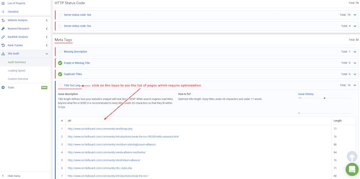
Moreover, as mobile users now make up a large part of those searching, make sure your snippets fit the size of their screens. It may happen that your meta titles and descriptions are too long.
In this case, you’d better shorten them and increase your chances of engaging mobile users with your catchy snippets. No need check them all manually; you can go with Serpstat Site Audit. Enter your URL on the landing page, tap ‘Add new project’ and then ‘Start Audit’. The tool will analyze your website and identify crucial technical errors. It will also find meta title and description optimization errors and will provide you with a list of pages you’d better optimize your meta tags for. With its Meta Tags report, you’ll see all your duplicate, missing, and too long (or short) titles and descriptions:
XML Sitemap and robots.txt
All the links to your XML Sitemap should be accessible from the mobile version of your site. These files lead Google to all your important pages, so it’s crucial that crawlers can find them. Robots.txt directives are used to inform crawlers of which areas of the site may be crawled or not. Make sure you control them on both versions of your site.
Content
Do both versions contain the same content? All the important and high-quality data should exist on your mobile site if you want it to get indexed by Google. Avoid disabling certain pieces of content on the mobile version.
As mobile-first indexing means your mobile content is prioritized, check whether all the content types on your page are indexable. Don’t forget to optimize your content not only for crawlers but also for mobile users. For this purpose, follow the next steps:
- Provide a clear structure of your texts. Being constantly in a rush, mobile users prefer easy-to-consume information. Dividing your texts into paragraphs, you make them more catchy and readable.
- Use expandable menus. Remember how Google crawls all the content hidden in drop downs on mobile? Using hamburger and accordion menus, you save the limited screen size and improve user experience significantly.
- Forget about Flash. Many mobile devices now don’t see Flash content. You can replace it with HTML5 or Java.
- Develop a finger-friendly design. If the buttons on your page are too small, smartphone users will accidentally click the wrong ones and get irritated.
Page speed
Your page speed is the first thing users face when clicking through to your page. If it’s too slow, there is little chance they will stay long on your site. The time needed for your page to load is even more important for mobile users. These people are often on their way somewhere, and they want to get the necessary data as quickly as possible. Otherwise, they’ll find it somewhere else.
Moreover, from July 2018, Google started to consider mobile speed when ranking websites for mobile searches. So, not to hurt both your rankings and user experience, you’d better check your page speed and optimize it if necessary.
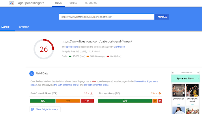
PageSpeed Insights will provide you with the data on your site’s loading speed and highlight the crucial issues for you to fix.
Structured data
Structured data is a piece of code you should add to HTML markup for search engines to better understand your content structure. It is used to help Google interpret what your website contains. Applying structured data, you can organize and highlight the most crucial information.
Structured data application may help you get rich or featured snippets that make your site stand out in search results:

To learn how to implement structured data, use Schema.org vocabulary.
Mind that with mobile-first indexing, your schema markup should be identical on both versions of your site. What’s most important, URLs you use in the structured data on mobile should correspond to the mobile URLs.
Don’t panic when it comes to mobile-first indexing
Mobile-first indexing isn’t something Google has invented to confuse you and hurt your rankings. For those who drive websites with responsive mobile design, this transition doesn’t affect anything.
In case you don’t have a mobile version of your site or responsive design (although that would be pretty surprising), it’s a great sign for you to start considering mobile users in your marketing strategy.