5 Simple Questions to Ask Your Homepage (and every top page on your site)

Click! The page loads. A visitor has landed on your website. What happens next? One of these two things:
- The page succeeds. The visitor falls in love, goes deeper into the site, subscribes or becomes a lead.
- The page fails. The visitor is confused, frustrated or annoyed. They leave and don’t return.
Lots of little factors determine the success or failure of your page. From copy to key phrases, from headlines to human psychology. Making that page great means keeping a lot of things in mind at the same time.
This post is a list of questions you can ask your top pages. They will force you to:
- Sharpen your focus on the visitor and results.
- To create clarity, not just beauty.
- To think beyond your brand and your personal opinions.
Let’s check the questions:
- What’s going on in the life of this visitor?
- Can visitors tell what you do at a glance?
- Does this page answer the visitor’s top questions?
- What is the best order for the information on this page?
- Are the sections for headers meaningful? Are they helpful?
Put all of your top pages to this test, not just your homepage. If you don’t have a great answer for each question, you have an opportunity to improve results.
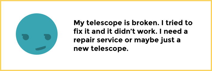
Instead of using real examples of less-than-stellar websites, we’ll use a fictional company, Stella’s Optics. Stella offers telescope products and services…
Visitors, Context and First Impressions
Empathy is everything in marketing. Understanding the perspective of your visitor is step one in making an effective page.
1. What’s going on in the life of this visitor?
There’s a true story happening in the life of every visitor to every page. It’s why they came. What are they looking for? What problem are they trying to solve? What have they likely already done to solve that problem?
Everything on this page must flow from here.
2. Can visitors tell what you do at a glance?
Every visitor starts with the same question: Am I in the right place? So a great page answers that question in the first split second of the visit. The visitor can tell, at a glance, where they are and what you do.
Notice how vague headlines and navigation labels make it harder for visitors to tell what you do at a glance:
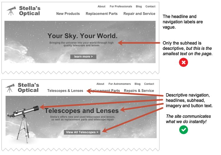
For a lot of sites, the small text right below the headline is the most descriptive part of the page. Ironic, isn’t it? The smallest thing is the most important thing. For these sites, simply flipping the header and text below it will make the page communicate what it’s about much faster.
Your page has three opportunities to tell the visitors what you do:
- The navigation. Descriptive navigation can indicate what you offer at the top of every page. Keyphrase focused navigation also gives you a small SEO advantage.
- The headline. If it’s clever and unclear, it doesn’t help visitors know where they are.
- The subhead or body text. If none of the above tell them what you do, visitors may need to look closely and start reading to see what you offer. Not ideal.
Not sure if your page is explicit enough? Take the 5-second test.
Upload the page to UsabilityHub to have it reviewed by a bunch of people. Ask up to three questions, such as what do you remember? What was this page about?
Any gaps will show up in the report, which is viewable as raw data or a word cloud. Here’s a sample report on the word cloud view for the question “What does this site do?”
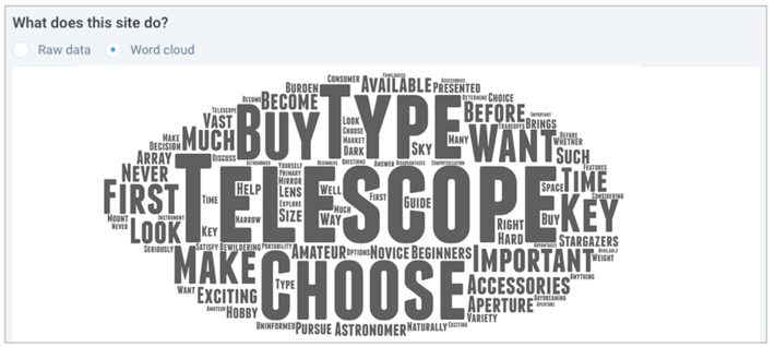
If the big words aren’t descriptive, you’re in trouble. There are other fun versions of the 5-Second Test:
- The Squint Test (squint your eyes)
- The 10 Foot Test (stand back from your screen 10 feet)
- The User is Drunk Test (give someone a bunch of drinks then ask them to review your page)
The goal for each is the same: verify that the page communicates fast with perfect clarity.
Content, Prominence and Page Structure
Now we know why they came. We’ve told them where they are. The next job is to give them what they came for.
Your visitors aren’t here for the pretty pictures or fancy features. Most visitors are here for one reason: answers. Take a look at the research.
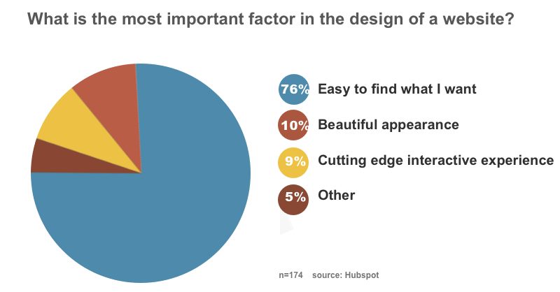
They came looking for specific information. So we need to provide that info in a way that’s easy to find or they are likely to leave and look somewhere else.
3. Does this page answer the visitor’s top questions?
Visitors won’t take action until they find answers to their biggest questions. Almost immediately, they begin scrolling and scanning. They want answers, and they’re moving fast.
If you aren’t sure what visitors are looking for, ask the sales team or anyone who works on the front line with customers and prospects. Better yet, talk to customers yourself.
Joel Klettke, of Business Casual Copywriting, is an expert at interviewing customers. He has an excellent set of questions he asks when researching an audience. If Stella worked with Joel, here’s what he might ask when interviewing customers who buy lenses.
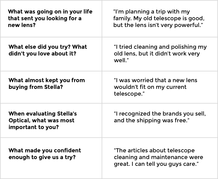
Now you have a good idea for what information to include on the page about lenses.
4. What is the best order for the information on this page?
Not all answers are equally important. Some things are deal-breakers, some things are nice-to-haves. Some things matter to everybody. Some things are relevant to only a few visitors.
Prioritize the of messages and visuals with this in mind.
For visitors to Stella’s page about lenses, we know from our research what visitors need:
- Most visitors want to see that trusted brands are available.
- A lot of visitors are worried about the sizes of lenses.
- And cleaning and storage is another big concern for some people.
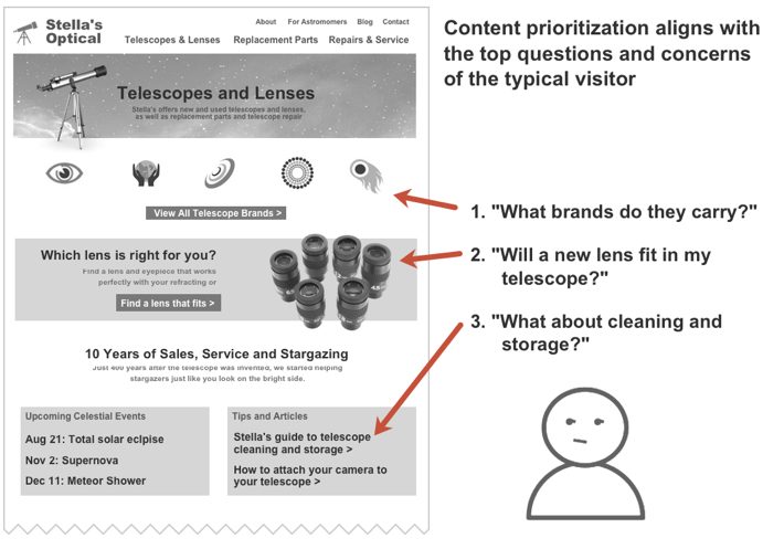
A great page emulates a conversation with a sales associate. It anticipates the visitor’s thoughts and provides answers in the general order in which the questions would be asked.
5. Are the sections for headers meaningful? Are they helpful?
All webpages are divided into sections with headers. These headers tell the visitors what that section is about. But often, they are too big and too vague, distracting from the items in that section. They aren’t helpful.
Here are two examples of a news box on Stella’s telescope website.
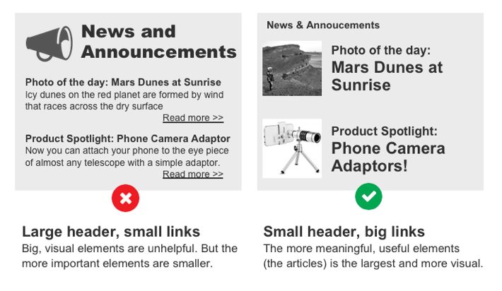
The first has a big, visual header that pulls attention away from the more important, clickable elements below the articles. The second header is quieter, making the more meaningful element below it more prominent.
Ask yourself if each header (and every element) is helpful and necessary. If not, remove it or make it smaller.
How did your page do?
There are a lot of little things that make a page effective. Content and keywords, structure and psychology. Every little gap may be a problem, but it’s also an opportunity to improve.
We hope you found at least one or two opportunities here. And as always, we’d be grateful if you shared any other questions we should all ask about our pages.
Leave a comment to help us and your fellow readers make our pages the best they can be!
The article was first published on Orbit Media Blog