
15 Presentation Design Statistics for 2019

As you work on your presentation slides, toiling away for hours, have you ever wondered how everyone else does it?
Do they struggle with their layouts, their color palettes and summarizing information?
Do they have a better process for completing their designs, or do they use a designer?
Have you ever sat in a conference, seen an impressive slide deck and thought, “Now that’s a sweet slide deck.”

Then wonder how they managed to create something so special?
Well, I’m going to answer those questions for you!
The folks at Venngage, the online presentation maker, reached out to speakers who presented at a number of conferences this year and asked them about their process. We wanted to find out how they constructed their slide decks, and how they made them engaging.
We had the speakers answer 15 specific questions about how they manage presentation design. Their answers revealed quite a bit about their design choices, approaches, challenges, and what seems to work best for them.
And I’m going to share their answers with you. These insights will come in handy as you prepare for 2019 and a brand new round of presentations and talks:
- What was the main goal that presenters were trying to achieve with their slide decks?
- Did they typically design their own presentations and slides, or did they outsource the work to another designer?
- How long did it take speakers to design their own slide decks and presentations?
- Were their slides typically more text-heavy or more visually focused?
- What percentage of their slide decks consisted of text?
- Which types of visuals were most frequently included in presentations?
- How many slides on average were included in their presentations?
- How many minutes did their presentations run for?
- What percentage of their presentations consisted of their brand colors?
- Had they ever gotten feedback from their audience specifically for their presentation design?
- How proud were they of the overall design of their slide decks, on a scale of 1 to 10?
- What kinds of color palettes did they prefer using in their presentation design?
- How frequently did they reuse the same slide deck, or give the same presentation?
- What was their process for getting a presentation ready?
- What were the most difficult parts of putting together a slide deck?
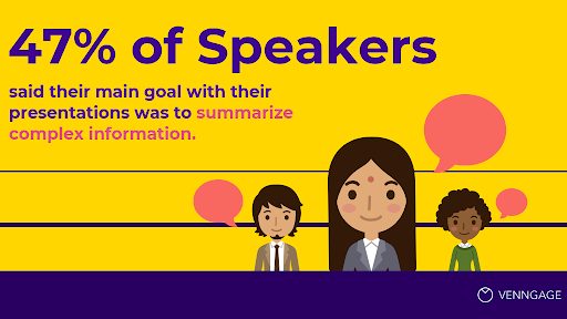
1. What was the main goal that presenters were trying to achieve with their slide decks?
Nearly half of all speakers surveyed (47%) stated that their main objective when designing their presentations was to summarize complex information so that it would be easier for their audience to digest the content.
At the same time, a quarter of presenters (24.5%) wished to create slide decks that entertained and inspired their audiences.
Other goals included telling a story or sharing a case study of personal experiences (16.7%); simplifying processes into actionable tactics that their audience could apply right away (9.8%), and sharing significant statistics and facts (2%).
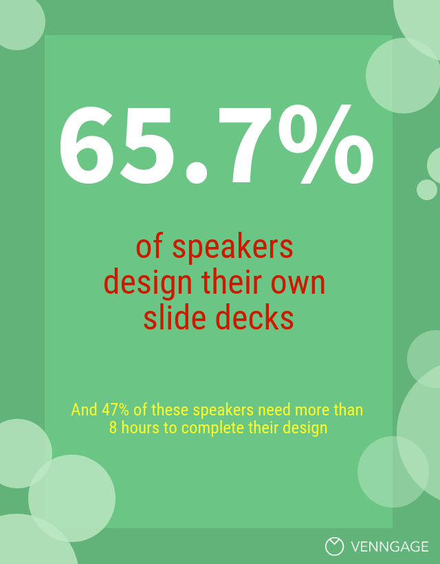
2. Did they typically design their own presentations and slides, or did they outsource the work to another designer?
Turns out that a whopping 65.7% of presenters sit down to design their own presentations, while only 4.9% of the speakers surveyed hired someone to do it for them.
The remaining 29.4% of speakers did some of the design work themselves and had help from a designer as well.
That means almost 95% of speakers take the time to work on their own presentations! So you’re certainly not alone.
3. How long did it take speakers to design their own slide decks and presentations?
Now, the speakers who designed their own presentation apparently spent anywhere between 1 to over 8 hours designing their slides.
47% said that it took them more than 8 hours to design their slide deck, while 28.5% said it took them between 5 and 8 hours to design their presentation.
Only 19.6% said it took them between 1 and 3 hours to design their presentation.
We wondered how some presenters could spend over 8 hours, while others spend less than 3 to design their presentation slides. So we spoke to our support team to determine how long Venngage users spend on their presentation designs.
On average, those who used an existing presentation template spent between 45 minutes to 2 hours to complete a slide deck. However, users who started from scratch and chose to begin with a blank canvas took anywhere between 8 to 12 hours to complete a design.
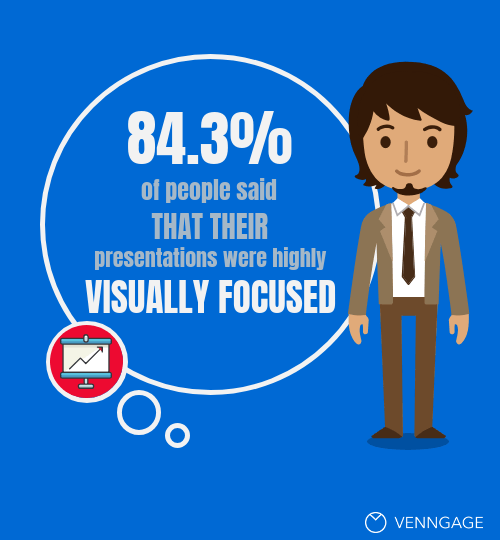
4. Were their slides typically more text-heavy or more visually focused?
84.3% of presenters said that their presentations were highly visually focused.
I’m surprised the number wasn’t higher.
Last year, we surveyed marketers to identify how they were using visual content in their marketing efforts. We found that from 2015 to 2016 alone, the use of visual content in articles had increased by 130% due to clearly higher engagement levels from visually-focused blog content.
5. What percentage of their slide decks consisted of text?
About half of all speakers surveyed (54.9%) said that only 25% of their entire presentations consisted of text, whereas 15.7% of speakers surveyed said that their presentation decks were more text heavy than visual.
6. Which types of visuals were most frequently included in presentations?
About a third of speakers (34.3%) relied primarily on photographs and stock photos for their presentations.
This is a significant number of speakers, and somewhat surprising. We learned previously from our survey on visual content that only 7.6% of marketers felt that photography and stock photos even resulted in high engagement.

A majority of marketers (41.5%) stated they had seen higher engagement rates from visuals such as infographics and original graphics.
18.6% of presenters surveyed claimed to use original graphics or charts in their presentations, while 15.7% said they primarily used illustrations and icons.
One individual surveyed even went a step further and said:
“Charts and support elements are my biggest stumbling block. I am a practitioner and usually have a really good idea about the story I would like to tell, but when it comes down to finding the right graph or free template to help me, I stumble. It’s really, really hard to find good support elements!”
There’s a lot of emphasis on incorporating good storytelling in a presentation, which is essential to any engaging presentation. But it often seems there isn’t enough focus on data visualization and the use of graphs and charts as supporting, storytelling elements.
Lastly, 24.5% of speakers said they used a lot of screenshots, while 6.9% said they used mostly memes and GIFs.
7. How many slides on average were included in their presentations?
The speakers surveyed spoke for about an hour on average at their events.
41.2% said that they had between 21 and 40 slides in their presentations.
On the opposite end, 8% of speakers used between 90 and 120 slides, and as little as 3.9% of presenters surveyed used more than 120 slides in their talks.
Personally, I feel that having a high number of slides is helpful because it lets you link visual content to each of your key points. As well, it keeps the pace of the presentation up. The more time spent dwelling on a single slide, the more likely your audience is to tune out.
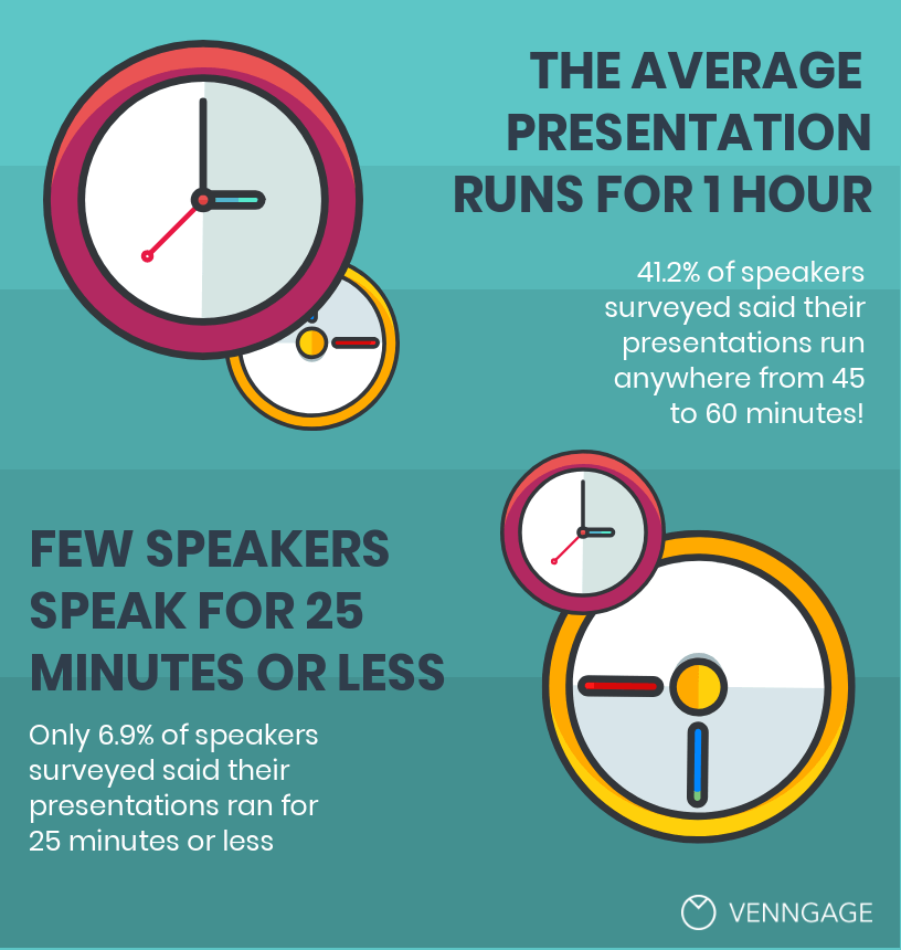
8. How many minutes did their presentations run for?
41.2% of speakers said they now give presentations that last anywhere between 45 and 60 minutes.
Only 6.9% said their presentations last less than 25 minutes.
If you’re wondering how people can hold an audience’s attention for that long, consider popular YouTube videos. Speakers incorporate frame changes and energy changes every 10 seconds, and new points are made every 30 to 60 seconds. This helps to keep viewers tuned in and attentive.
Using a high number of slides with plenty of visual cues is the presentation equivalent of a YouTube video with numerous frame changes.
9. What percentage of their presentations consisted of their brand colors?
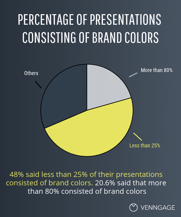
48% said that less than 25% of their presentations consisted of branded color schemes.
20.6% said that more than 80% of their presentations consisted of brand colors and only 6.9% said they used their branding between 40% to 60% of the time.
For the most part, slide decks were either incredibly brand focused, or not at all.
10. Had they ever gotten feedback from their audience specifically for their presentation design?
64.7% of speakers said they had received positive feedback on their presentation designs and only 1% said they had received negative feedback on their design.
But 34.3% said they actually never received any feedback on their designs at all.
Now, not to be a downer, but chances are if people didn’t happen to comment on your presentation slides, there’s a good chance it wasn’t memorable.
Delivering an outstanding presentation is something all speakers aim for, and for the 25 to 60 minutes you’re up there presenting, your audience is staring at your slides.
So if your slides contain meaningful insights and look great, the chances of your audience commenting on your slides, or taking pictures and sharing them online, are much higher.
11. How proud were they of the overall design of their slide decks, on a scale of 1 to 10?
We also asked these speakers how proud they were of their slide design on a scale of 1 to 10.
52.8% said their pride fell somewhere between an 8 and a 10.
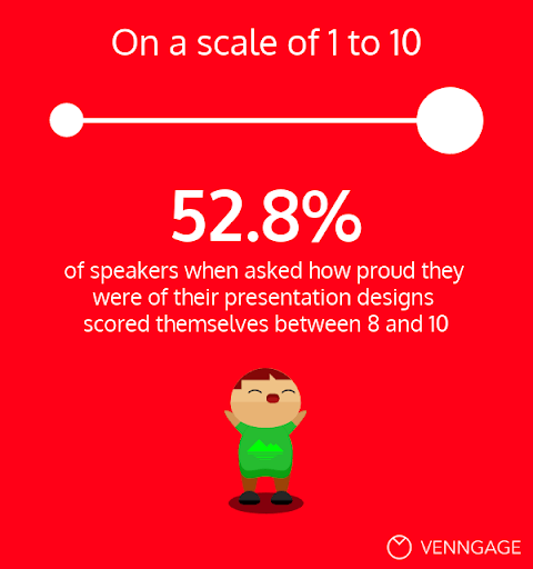
Only 3% rated themselves a 4 or lower, and 44.2% fell somewhere in between a 5 and a 7.
12. What kinds of color palettes did they prefer using in their presentation design?
Since we already addressed that most speakers shied away from using their brand colors in their presentations, we wanted to learn a bit more about what types of color schemes and palettes they were drawn to.
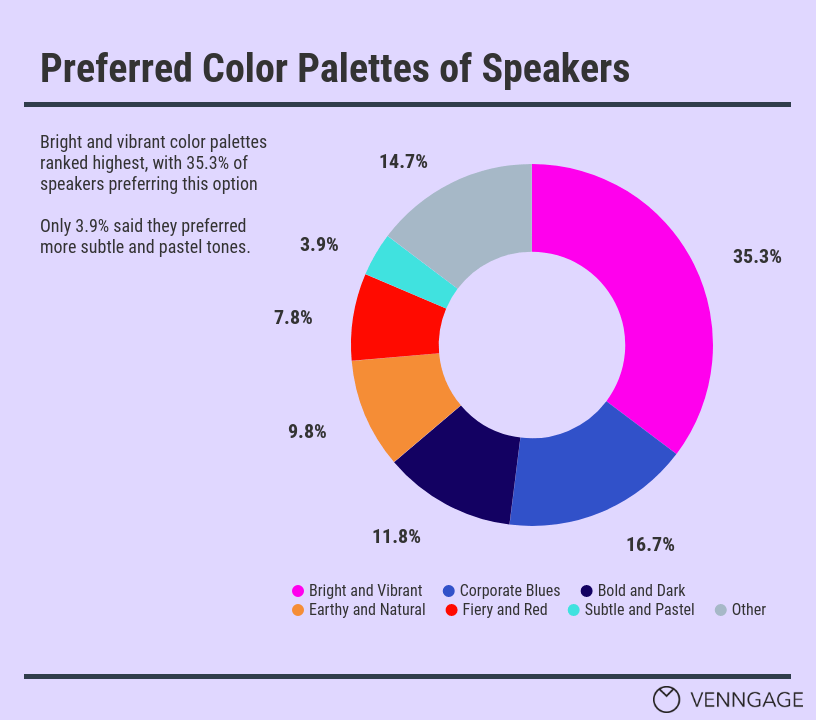
Here’s what they said:
- 35.3% of speakers leaned towards a bright and vibrant color palettes
- 16.7% stated they preferred corporate, cool and blue tones in their presentations
- 11.8% said they liked bolder and darker color schemes
- 9.8% said they preferred more earthy and natural tones
- 7.8% of people stated that they preferred fiery and red tones
- 3.9% said they liked color schemes that were more subtle and consisted of pastel tones
A remaining 14.7% of speakers chose the “Other” option and shared a much wider range of specific color schemes consisting of their specific brand colors, or variations of the above palettes (such as “neon” or “brown tones”).
13. How frequently did they reuse the same slide deck, or give the same presentation?
As mentioned above, many speakers spent over 8 hours when it came to designing a presentation, so it only makes sense that they would repurpose or reuse that presentation a few times.
53% said they reused the same slide deck between 2 and 4 times.
19.6% said that they gave the same presentation more than 8 times.
On top of that, 14.7% said they gave the same talk between 5 and 8 times.
12.7% said they gave the talk only 1 time.
It’s also worth noting that some people commented that even if they didn’t use the exact same presentation multiple times, they would repurpose certain parts or ideas multiple times in different talks.
14. What was their process for getting a presentation ready?
33.3% of those surveyed said they typically started with the content or an outline and then broke down their script or notes to plug into a deck. For these individuals, design came as a last thought.
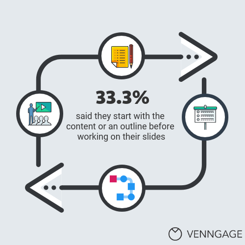
26.5% said they started with a skeleton of the entire presentation and then added the design elements to that.
4.9% of people said they would think about the overall theme or design of the presentation, and figure out the exact content later on.
32.4% actually built the content and the presentation simultaneously.
2.9% had a variety of more specific processes for their own presentation design, such as determining the audience level first, or starting by talking out loud and letting their natural expertise guide the flow of the overall presentation.
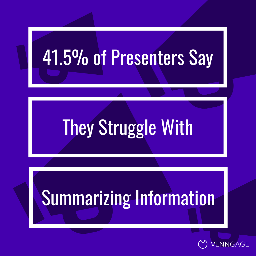
15. What were the most difficult parts of putting together a slide deck?
Finally, we asked speakers to tell us everything they found most difficult about putting together their slide decks.
45.1% said they struggled primarily with figuring out how to summarize and condense their content so it would fit in a good presentation.
Funnily enough, this was also one of the most common goals many of the speakers had.
42.2% said they struggled with formatting their presentations in a way that would keep their audience excited and engaged.
25.5% said they struggled with finding good visual assets to include in their presentation, such as charts, photographs and illustrations.
8.9% said they had a hard time finding a design or a template that stood out from the less memorable designs they typically saw.
A few more challenges we identified among the survey responders included struggling with the actual rehearsal of their presentation, or finding the right pacing and flow to accompany the format of their presentation decks.
For these challenges, in particular, it is helpful to use more slides highlighting each new thought or phrase.
As you can see, there’s a world of speakers and presenters out there who share your experiences when it comes to designing presentations.
While everyone’s approach to design may be different, everyone has areas they struggle with and hope to improve on.
As you look to improve your own processes, whether it’s spending less time on designing your presentation, or not only using more visuals but the right visuals for your presentation, keep these 15 presentation design statistics in mind to guide your decisions.
Share your thoughts with me in the comments section!