Outbrain serves millions of requests per minute, based on a microservice architecture.Consequently, as you might expect, visibility and performance monitoring are crucial.
Serving millions of requests per minute, across multiple data centers, in a micro services environment, is not an easy task. Every request is routed to many applications, and may potentially stall or fail at every step in the flow. Identifying bottlenecks, troubleshooting failures and knowing our capacity limits are all difficult tasks. Yet, these are not things you can just give up on “because they’re hard”, but are rather tasks that every engineer must be able to tackle without too much overhead. It is clear that we have to aim for all engineers to be able to understand how their applications are doing at any given time.
Since we face all of these challenges every day, we’ve reached the point where a paradigm shift was required. For example, move from the old, familiar “investigate the past” to the new, unfamiliar “investigate the present”. That’s only one of the requirements we came up with. Here are few more:
Real-time visibility
Sounds pretty straightforward, right? However, when using a persistent monitoring system, it always has at least few minutes of delay. These few minutes might contain millions of errors that potentially affect your business. Aiming for low MTTR means cutting delays where possible, thus moving from minute-based granularity to second-base.
Throughput, Latency and error rate are linked
Some components might suffer from high latency, but maybe the amount of traffic they receive is negligible. Others might have low latency under high load, but that’s only because they fail fast for almost every request (we are reactive!). We wanted to view these metrics together, and rank them by importance.
Mathematical correctness at any given aggregation (Don’t lie!)
When dealing with latency, one should look at percentiles, not averages, as averages can be deceiving and might not tell the whole story. But what if we want to view latency per host, and then view it per data center ? if we store only percentiles per host (which is highly common in our industry), it is not mathematically correct to average them! On the other hand, we have so much traffic that we can’t just store any measurement with its latency; and definitely not view them all in real time
Latency resolution matters
JVM based systems tend to display crazy numbers when looking at the high percentiles (how crazy ? With heavy gc storms and lock contention there is no limit to how worse these values can get). It’s crucial for us to differentiate between latency in the 99.5 and 99.9 percentiles, while values at the 5 or 10 percentiles don’t really matter.
Summing up all of the requirements above, we reached a conclusion that our fancy persistent monitoring system, with its minute-based resolution, supporting millions of metrics per minute, doesn’t cut it anymore. We like it that every host can write thousands of metric values every minute, and we like being able to view historical data over long periods of time, but moving forward, it’s just not good enough. So, as we often do, we sat down to rethink our application-level metric collection and came up with a new, improved solution.
Our Monitoring Unit
First, consider metric collection from the application perspective. Logically, it is an application’s point-of-view of some component: a call to another application, to a backend or plain CPU bound computation. Therefore, for every component, we measure its number of requests, failures, timeouts and push backs along with a latency histogram over a short period of time.
In addition, we want to see the worst performing hosts in terms of any such metric (can be mean latency, num errors, etc)
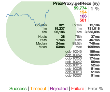
To achieve this display for each measured component we decided to use these great technologies:
HDR Histograms
HdrHistogram supports the recording and analysis of sampled data value counts, across a configurable value range, with configurable value precision within the range. It is designed for recording histograms of latency measurements in performance-sensitive applications.
Why is this important? Because when using such histograms to measure the latency of some component, it allows you to have good accuracy of the values in the high percentiles at the expense of the low percentiles
So, we decided to store in memory instances of histograms (as well as counters for requests, errors, timeouts, push backs, etc) for each measured component. We then replace them each second and expose these histograms in the form of rx.Observable using our own OB1K application server capabilities.
All that is left is to aggregate and display.
Java Reactive extensions
https://github.com/ReactiveX/RxJava
rx is a great tool to merge and aggregate streams of data in memory. In our case, we built a service to merge raw streams of measured components; group them by the measured type, and aggregate them in a window of a few seconds. But here’s the trick – we do that on demand. This allows us to let the users view results grouped by any dimension they desire without losing the mathematical correctness of latency histograms aggregation.
Some examples of the operators we use to aggregate the multiple monitoring units:
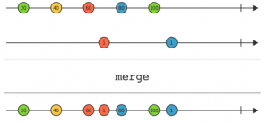
rx merge operator enables treating multiple streams as a single stream
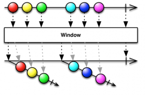
rx window operator enables sliding window abstraction
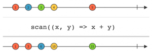
rx scan operator enables aggregation over each window
To simplify things, we can say that for each component we want to display, we connect to each machine to fetch the monitored stream endpoint, perform ‘merge’ to get a single stream abstraction, ‘window’ to get a result per time unit, and ‘scan’ to perform the aggregation
Hystrix Dashboard
The guys at Netflix found a great formula for displaying serving components’ status in a way that links between volume, error percentage and latency in a single view. We really liked that, so we adopted this UI to show our aggregated results.
The hystrix dashboard view of a single measured component shows counters of successes, failures, timeouts and push backs, along with a latency histogram, information on the number of hosts, and more. In addition, it provides a balloon view, which grows/shrinks with traffic volume per component, and is color-coded by the error rate.
See below how this looks in the breakdown view of all request components. The user gets a view of all measured components, sorted by volume, with a listing of the worst performing hosts.
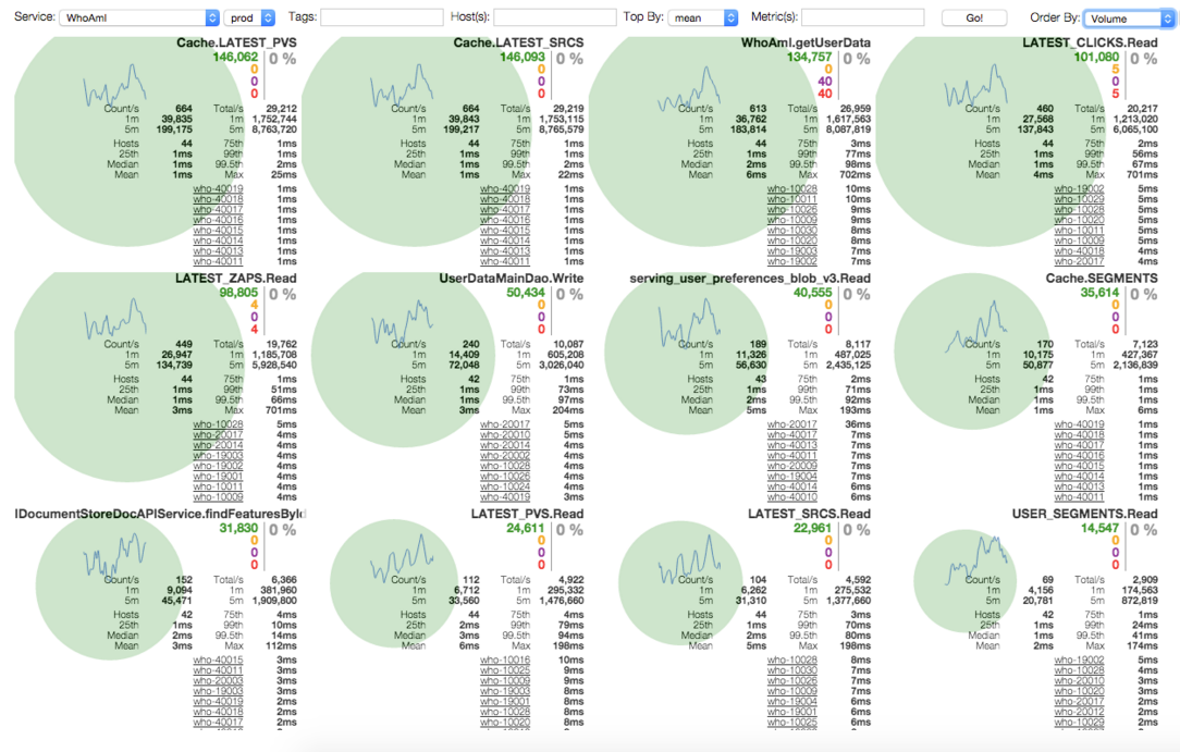
Another example shows the view of one application, with nothing but its entry points, grouped by data center. Our Operations guys find this extremely useful when needing to re-balance traffic across data centers.

OK, so far so good. Now let’s talk about what we actually do with it.
Troubleshooting
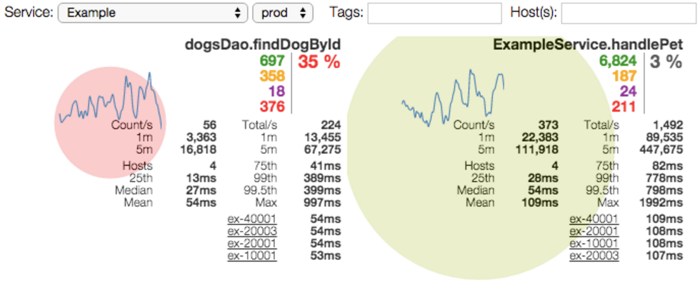
Sometimes an application doesn’t meet its SLA, be it in latency or error rate. The simple case is due to a broken internal component (for example, some backend went down and all calls to it result in failures). At this point we can view the application dashboard and easily locate the failing call. A more complex use case is an increase in the number of calls to a high latency component at the expense of a low latency one (for example, cache hit rate drop). Here our drill down will need to focus on the relative amount of traffic each component receives – we might be expecting a 1:2 ratio, while in reality we might observe a 1:3 ratio.
With enough alerting in place, this could be caught by an alert. Having the real-time view will allow us to locate the root cause quickly even when the alert is a general one.
Performance comparison
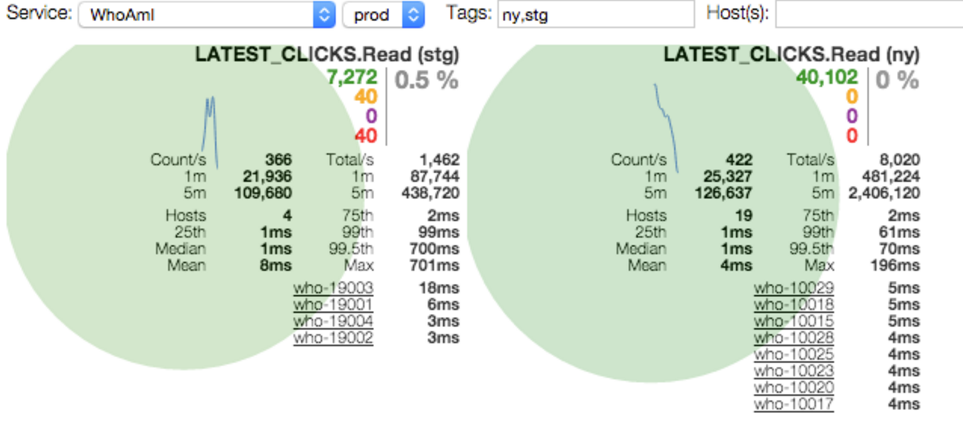
In many cases we want to compare the performance of two groups of hosts doing the same operation, such as version upgrades or topology changes. We use tags to differentiate groups of machines (each datacenter is a tag, each environment, and even each hostname). We then can ask for a specific metric, grouped by tags, to get the following view:
Load testing
We conduct several types of load tests. One is where we shift as much traffic as possible to one data center, trying to hit the first system-wide bottleneck. Another is performed on specific applications. In both cases we use the application dashboard to view the bottlenecks, just like we would when troubleshooting unexpected events.
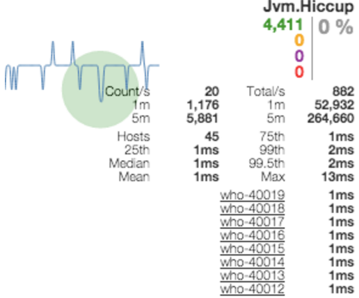
One thing to keep in mind is that when an application is loaded, sometimes the CPU is bounded and measurements are false because threads just don’t get CPU time. Another case where this happens is during GC. In such cases we must also measure the effects of this phenomenon.
The measuring unit, in this case, is ‘jvm hiccup’, which basically means taking one thread, letting it sleep for a while and measuring “measurement time on top of the sleep time”. Low hiccups means we can rely on the numbers presented by other metrics.
What’s next?
Real-time monitoring holds a critical role in our everyday work, and we have many plans to leverage these measurements. From smarter metric driven load balancing in the client to canary deployments based on real application behavior – there is no limit to what you can achieve when you measure stuff in a fast, reliable manner.