You love Cassandra, but do you really know what’s going on inside your clusters?
 This blog post describes how we managed to shed some light on our Cassandra clusters, add visibility and share it with the open source community.
Outbrain has been using Cassandra for several years now. As all companies, we started small, but during the time our usage grew, complexity increased, and we ended up having over 15 Cassandra clusters with hundreds of nodes, spread across multiple data centers.
We are working in the popular micro services model, where each group has its own Cassandra cluster to ensure resources and problems are isolated. But one thing remains common – we need to have good visibility in order to understand what is going on.
We already use Prometheus for metrics collection, Grafana for visualising its data and Pagerduty as our alerting system. However, we still needed to have detailed enough visibility on the Cassandra internals to ensure we could react to any issues encountered before they became a problem and make appropriate and informed performance tunings. I have to admit that when you don’t encounter a lot of problems, you tend to believe that what you have is actually sufficient, but when you suddenly have some nasty production issues, and we had our fair share, it becomes very challenging to debug it efficiently, in realtime, sometimes in the middle of the night.
Let’s say, as a simple example, that you realized that the application is behaving slower because the latency in Cassandra increased. You would like to understand what happened, and you start thinking that it can be due to a variety of causes – maybe it’s a system issue, like a hardware problem, or a long GC. Maybe it’s an applicative issue, like an increase in the number of requests due to a new feature or an application bug, and if so you would like to point the developer to a specific scenario which caused it. If so it would be good if you could tell him that this is happening in a specific keyspace or column family. In this case, if you’re also using row cache for example, you would wonder if maybe the application is not using the cache well enough, for example the new feature is using a new table which is not in the cache, so the hit rate will be low. And Maybe it’s not related to any of the above and it is actually happening due to a repair or read repair process, or massive amount of compactions that accumulated. It would be great if you could see all of this in just a few dashboards, where all you had to do in order to dig into these speculation of your could be done in just a few clicks, right? Well, that’s what Cassibility gives you.
Take a look at the following screenshots, and see how you can see an overview of the situation and pinpoint the latency issue to number of requests or connections change, then quickly move to a system dashboard to isolate the loaded resource:
* Please note, the dashboards don’t correspond to the specific problem described, this is just an example of the different graphs

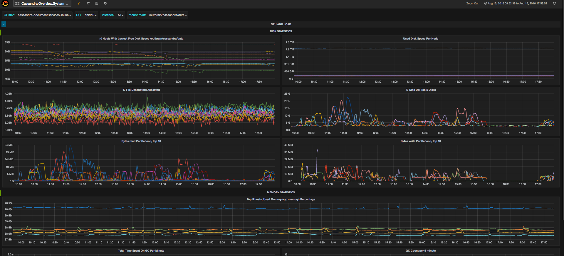
Then if you’d like to see if it’s related to specific column families, to cache or to repairs, there are dedicated dashboards for this as well


Here is the story of how we created Cassibility.
We decided to invest time in creating better and deeper visibility, and had some interesting iterations in this project.
At first, we tried to look for an open-source package that we could use, but as surprising as it may be, even with the wide usage of Cassandra around the world, we couldn’t find one that was sufficient and detailed enough for our requirements. So we started thinking how to do it ourselves.
Iteration I
We began to dig into what Cassandra can show us. We found out that Cassandra itself exposes quite a lot of metrics, could reach dozens of thousands of metrics per node, and they can be captured easily via JMX. Since we were already using the Prometheus JMX exporter (https://github.com/prometheus/jmx_exporter) in our Prometheus implementation, it seemed like the right choice to use it and easy enough to accomplish.
Initially we thought we should just write a script that exposes all of our metrics and automatically create JSON files that represent each metric in a graph. We exposed additional dimensions for each metric in order to specify the name of the cluster, the data center and some other information that we could use to monitor our Cassandra nodes more accurately. We also thought of automatically adding Grafana templates to all the graphs, from which one could choose and filter which cluster he wants to see, which datacenter, which Keyspace or Column Family / Table and even how to see the result (as a sum, average, etc.).
This sounded very good in theory, but after thinking about it a bit more, such abstraction was very hard to create. For instance there are some metrics that are counters, (e.g number of requests) and some that are gauge (e.g latency percentile). This means that with counters you may want to calculate the rate on top of the metric itself, like when you would want to take the number of requests and use it to calculate a throughput. With a gauge you don’t need to do anything on top of the metric.
Another example is how you would like to see the results when looking at the whole cluster. There are some metrics, which we would like to see in the node resolution and some in the datacenter or cluster resolution. If we take the throughput, it will be interesting to see what is the overall load on the cluster, so you can sum up the throughput of all nodes to see that. The same calculation is interesting at the keyspace or column family level. But if you look at latency, and you look at a specific percentile, then summing, averaging or finding maximum across all nodes actually has no meaning. Think about what it means if you take the number that represents the request latency which 99% of the requests on a specific node are lower than, and then do the maximum over all nodes in the cluster. You don’t really get the 99’th percentile of latency over the whole cluster, you get a lot of points, each representing the value of the node with the highest 99’th percentile latency in every moment. There is not much you can do with this information.
There are lot of different examples of this problem with other metrics but I will skip them as they require a more in depth explanation.
The next issue was how to arrange the dashboards. This is also something that is hard to do automatically. We thought to just take the structure of the Mbeans, and arrange dashboards accordingly, but this is also not so good. The best example is, of course, that anyone would like to see an overview dashboard that contains different pieces from different Mbeans, or a view of the load on your system resources, but there are many other examples.
Iteration II
We realized that we need to better understand every metric in order to create a clear dashboard suite, that will be structured in a way that is intuitive to use while debugging problems.
When reviewing the various sources of documentation on the many metrics, we found that although there was some documentation out there, it was often basic and incomplete – typically lacking important detail such as the units in which the metric is calculated, or is written in a way that doesn’t explain much on top of the metric name itself. For example, there is an Mbean called ClientRequest, which includes different metrics on the external requests sent to Cassandra’s coordinator nodes. It contains metrics about latency and throughput. On the Cassandra Wiki page the description is as follows:
Latency: Latency statistics.
TotalLatency: Total latency in microseconds
That doesn’t say much. Which statistics exactly? What does the total mean in comparison to just latency? The throughput, by the way, is actually an attribute called counter within the latency MBean of a certain scope (Read, Write, etc.), but there are no details about this in the documentation and it’s not that intuitive to understand. I’m not saying you can’t get to it with some digging and common sense, but it certainly takes time when you’re starting.
Since we couldn’t find one place with good and full set of documentation we started digging ourselves, comparing values to see if they made sense and used a consultant named Johnny Miller from digitalis.io who has worked a lot with Cassandra and was very familiar with its internals and metrics.
We improved our overall understanding at the same time as building and structuring the dashboards and graphs.
Before we actually started, we figured out two things:
- What we are doing must be something that many other companies working with Cassandra need, so our project just might as well be an open-source one, and help others too.
- There were a lot of different sections inside Cassandra, from overview to cache, entropy, keyspace/column family granularities and more, each of which we may want to look at separately in case we get some clues that something may be going on there. So each such section could actually be represented as a dashboard and could be worked on in parallel.
We dedicated the first day to focus on classifying the features into logical groupings with a common theme and deciding what information was required in each one.
Once we had defined that, we then started to think about the best and fastest way to implement the project and decided to have a 1 day Hackathon in Outbrain. Many people from our Operations and R&D teams joined this effort, and since we could parallelize the work to at most 10 people, that’s the number of people who participated in the end.
This day focused both on creating the dashboards as well as finding solutions to all places where we used Outbrain specific tools to gather information (for example, we use Consul for service discovery and are able to pull information from it). We ended the day with having produced 10 dashboards,with some documentation, and we were extremely happy with the result.
Iteration III
To be sure that we are actually releasing something that is usable, intuitive to use and clear, we wanted to review the dashboards, documentation and installation process. During this process, like most of us engineers know, we found out that the remaining 20% will take quite a bit to complete.
Since in the Hackathon people with different knowledge of Cassandra participated, some of the graphs were not completely accurate. Additional work was therefore needed to work out exactly which graphs should go together and what level of detail is actually helpful to look at while debugging, how the graphs will look when there are a lot of nodes, column families/tables and check various other edge cases. We spent several hours a week over the next few weeks on different days to finalize it.
We are already using Cassibility in our own production environment, and it has already helped us to expose anomalies, debug problems quickly and optimize performance.
I think that there is a big difference between having some visibility and some graphs and having a full, well organized and understandable list of dashboards that gives you the right views at the right granularity, with clear documentation. The latter is what will really save you time and effort and even help people that are relatively new to Cassandra to understand it better.
I invite you to take a look, download and easily start using Cassibility: https://github.com/outbrain/Cassibility. We will be happy to hear your feedback!
You are already using Cassibility in your own production environment, and it has already helped us to expose anomalies, debug problems quickly and optimize performance.
wow.. great article about an interesting topic. Of course you use cassandra but what do you think is cassandra best in class? or what are the major disadvantages?.