
Using Heat Maps to Increase Content Performance

Is my piece of content performing?
It’s a question every marketer is plagued with, but one that often goes unanswered.
Sure, you can log into Google Analytics and pinpoint who is coming from what source and at what volume. You can add up all your social shares. Maybe you’ve even used this adjusted bounce rate solution to make a more accurate measurement of whether or not someone has actually bounced from your article.
But how are you really evaluating what people are engaging and interacting with on a particular piece of content?
That’s a little more tricky.
Wouldn’t it be easier to track where people are clicking on your content or the amount of time they spend viewing each area?
Admittedly, I’m sure many of you have heard or read about heat mapping technology that can help you do this. Or maybe you’ve just been asking yourself, “do heat maps actually work?”
Heat maps are graphical representations of data. Developed in the mid-90s by software maker Cormac Kinney, the idea was pitched to help securities traders beat the market. Today, heat map tracking is a great way to visualize the aggregated behavior of site visitors on content.
Nielsen Norman Group’s heat map research on banner blindness was a groundbreaking case for the importance of editorial content as banner ads were proven to be an ineffective way of commanding the reader’s attention.
Imagine being able to generate your own new ideas, as well as optimize content performance. That would ensure that your content initiatives reach their full potential and that you are connecting with your audience in a goal-oriented way.
I’ll discuss the basics of heat maps, available tools, then walk you through setting up, generating, and analyzing data you can work with.![]()
Different types of heat maps
There are a variety of heat maps available, each focused on different aspects of user behavior and interaction. Here are the main types you can test with:
- Click heat maps – what users click on
- Scroll heatmaps – how far they invest in your content
- Attention heat maps – areas most viewed
- Mouse movement heat maps – paths most taken
True to their names, you can identify “hot” or “cold” usage patterns by color. Simply put, the brighter or warmer the color, the better indication of activity.
Examples of how to use the different types of heat maps for content optimization
- Click maps are valuable for determining how well your CTAs are performing. Not getting a high CTR on that fresh button you implemented on the page? Try changing its text, color or shape.
- Scroll maps can help you discover how invested (or engaged) your readers are in a piece of content. If they aren’t making it to the bottom of your blog post, you may need to make some changes. Revisit subject matter, structure, or add in some media to keep them scrolling.
- Attention maps showcase important areas on your page. Ensuring a reader is comprehending your content means reducing noise that may be stealing their attention. Consider sidebar distractions, too many navigation options, or media that doesn’t support the content.
- Mouse movement maps, though 84-88% correlated to eye movements (or attention heatmaps), provide strong data on how readers maneuver through your content. Once they’ve finished reading an article, do they know where to go next? If they don’t, proper placement of a CTA to a related piece of content, product or service might be valuable.
Whether it’s content specific or related to your page’s usability, running some of these tests can help you evaluate and elevate performance.
On to the major players in the game for a classic one-on-one matchup.
Different heat map tools to choose from
There are many heat map tools and services on the market that offer similar types of data. Some in different forms of maps.
Check out some of the most reputable and useful providers:
Crazy Egg offers a 30-day free trial, or $9 basic plan (based on 10,000 visitors). You can’t go wrong with their powerful optimization tools. In addition to offering a heat and scroll map, access their overlay and confetti reports. See the number of clicks on each element of your page, or segment clicks by referral sources and search terms.

Inspectlet allows you to collect eye-tracking, scroll, and click data with their free plan. A bonus to that monthly plan is the 100 recorded sessions included with it. Record videos of your site visitors as they use your site, allowing you to see everything they do.

HotJar includes a free basic plan, based on sample size (2,000 page views/day). Select a click, move, or scroll heat map analysis for indications of visitor motivation and desire. You can also manage conversion funnels to help find the biggest opportunities for improvement.

Lucky Orange aggregates click data through heat maps, mouse movement maps, and scroll depth maps. With a free 7 day trial, or $10 monthly plan, you can find the actual div element users click on instead of relative mouse coordinates. More interested in real-time analytics? They’ve got a live visitor map for that.

Heatmap.me lets you test for free, for as long as you want (up to 1 million page views per month). While their heat map generator is basic and doesn’t provide scroll depth, they do share info on exit rate and top exit pages. Nothing you couldn’t pull from Google Analytics, but much easier to process from one, visual platform.

Now, how to decide which one is right for you.
Comparing heat map tools
I put the table below together to help you compare and contrast each of the tools and features listed. I realize this is a basic assessment, but it’s enough to prioritize initial needs and value.
| Basic Monthly Plans | Heat Map Types | Additional Features | |
| Crazy Egg | 30 day free trial or $9 (10,000 visitors) | Heatmap, scroll map | Overlay report, confetti report |
| Inspectlet | Free (1 website) | Eye-tracking, scroll, and mouse-click heatmaps | 100 recorded sessions for playback |
| HotJar | Free (2,000 page views/day) | Click map, mouse movement map, scroll map | Manage conversion funnels |
| Lucky Orange | 7 day free trial or $10 | Click map, mouse movement map, scroll depth map | Live visitor map for real-time analytics |
| Heatmap.me | Free (1,000,000 page views/month) | Click map | Exit rate, top exit page data |
At Outbrain, we use Crazy Egg. They make it easy to create a variety of “snapshots” to help visualize different data points. We then use those insights to inform decisions about how we optimize and create content.
I’ll walk you through how.
Outbrain’s Crazy Egg Scroll Map Use Case
Crazy Egg lets you take “snapshots” of a URL or page you would like to test.
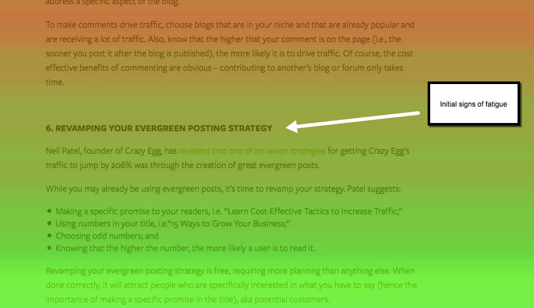
This is a scroll map snapshot we tested in our article “15 Cost Effective Tactics Online Marketers Use to Increase High-Quality Traffic to their Company’s Blog.”
Click for the whole snapshot.
Below, I’ve included a breakdown of the analysis.
Find things we noted as performance indicators, and the conclusions we drew that would then guide how to improve the piece of content.
1) Initial signs of fatigue, highlighted by the green color taking effect on our scroll map led us to believe that readers were getting bored. Dropping in media that correlated to the section’s topic would have added value, and kept audience attention. Maybe we could have turned the bullet points we included into an interesting graphic.
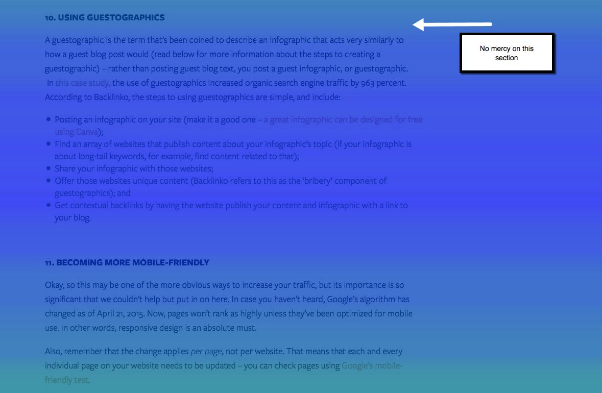
2) The deep blue area, representing the colder side of content consumption, had us considering whether the topic of “infographics” is just too saturated or played out. Directly after this section, user attention started to pick back up. Featuring a more relevant topic, or newer, unknown tactic may have worked better here.
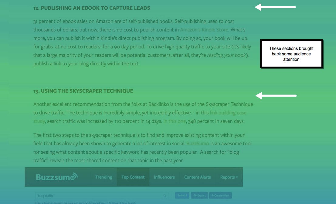
3) We thought they were goners. It looks like “Publishing an eBook to Capture Leads” is something our readers demonstrated some more interest in. Let’s use that to create more content based around generating leads. Maybe our own eBook with step-by-step instructions.
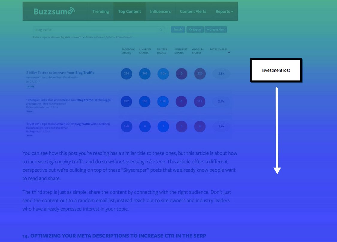
4) Once completely blue, consider the reader’s investment in content completely lost. Why though? We included a lot of important info, just going unnoticed. We probably should have placed these bottom topics higher up in the article. Since they have more to do with SEO, they would have flowed nicely underneath what we discussed on leveraging long-tail keywords.
As you can see, there are a lot of actionable insights here to take and apply. And that’s just using one type of heat map.
Even testing a handful of pages can help optimize your content’s performance. Or better yet, help you generate new ideas.
Making the Most of Heat Map Analytics and Beyond
Once you’ve decided on the right heat mapping tool for you, create a Google Spreadsheet to manage tests, results, recommendations, and new ideas. I’ve created this simple heat map testing template to help you do so.
Whether you’re just getting into content optimization or you consider yourself a seasoned vet, heat mapping can uncover behavioral insights you don’t want to neglect.
While heat map testing helps identify potential issues that may be affecting your content’s performance, there are many additional layers of content optimization left to address.
Neil Patel wrote a great article on SEO Copywriting: How To Write Content For People and Optimize For Google. You should read it. The performance marketer in you will be happy you did.
Not sure if you qualify as a performance content marketer? Here’s a list of some characteristics that make up a great content marketer. Heat map testing will surely let you check “statistician” off the list.
Conclusion
Evaluating what people are engaging with and how they are interacting with your content is important.
You can use click, scroll, attention and mouse movement heat map analytics to help ensure that your content is packaged for optimal consumption.
There are a variety of tools in the market that, for little to no cost, can provide actionable insights on how to increase content performance. Crazy Egg, Inspectlet, HotJar, Lucky Orange and Heatmap.me are just a few that you can compare.
If you start testing your content, you can figure out how well your content is performing. Try it, and use the information gathered to achieve your intended business goals.

![[Event Recap] 3 Highlights from Outbrain’s 2021 Unveil](https://www.outbrain.com/blog/wp-content/uploads/2021/01/OB-Blog-Post-Regular-Thumbnail-Unveil-Recap.jpg)