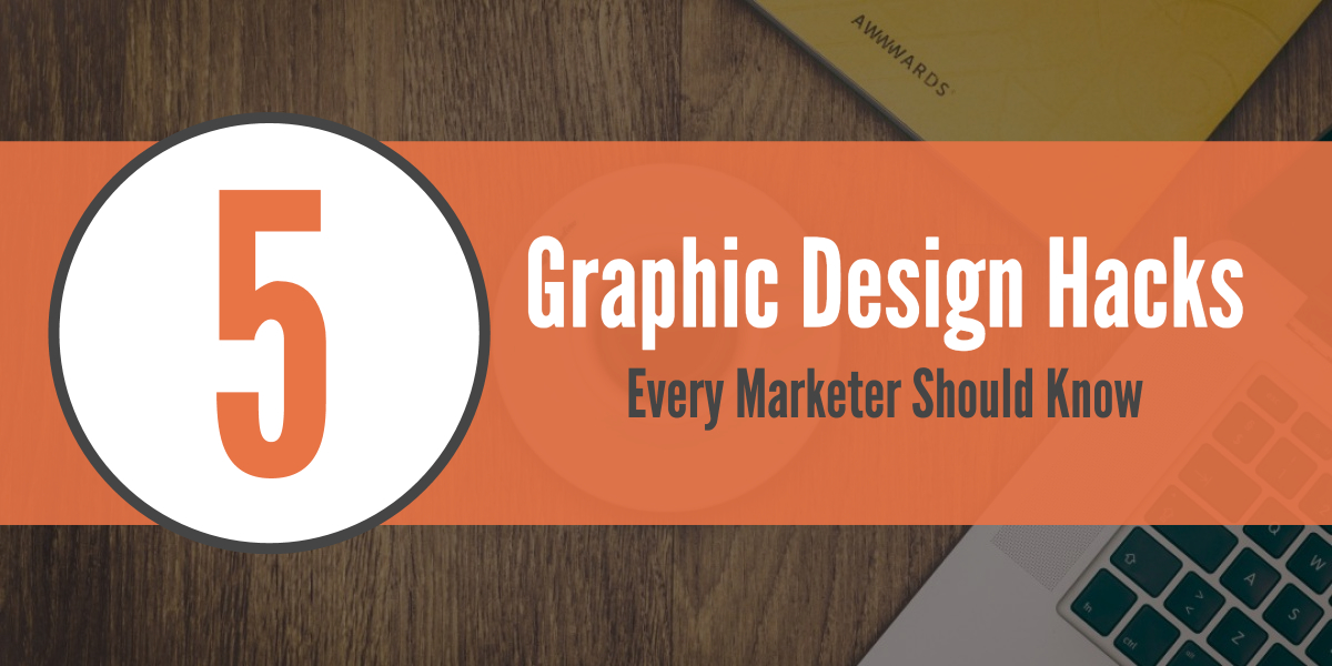
5 Design Hacks Every Digital Marketer Should Know

This one’s for you.
The marketers reading Outbrain’s blog.
You’re a skilled bunch, capable of executing killer marketing campaigns. Under your careful direction, it’s often no big deal getting new leads or sales.
But what about graphic design? Are you an all-star there too?
Unfortunately, if you’re like many marketers, the answer is often no. Graphic design is one area where you’re probably lacking (and that’s no fault of your own).
Historically, this was never really an issue. But as marketers are increasingly involved with content marketing and social media, the increasing demands of visual content seem to be falling more and more on the marketer’s lap.
Not to worry, though…
The post ahead is intended for those of you who, as marketers, weren’t blessed with the magical “eye” for design. Despite not being natural designers, you can still create great visuals for blog content and social media.
The key lies in grasping a few basic graphic design hacks.
Master these hacks and graphic design will cease to intimidate you — it will become manageable and maybe (just maybe) even a little fun.
Hack #1 – Strategically Select a Color Palette
An immediate way for you to hack graphic design is to strategically select your color palette.
Being strategic with the palette will allow you to control the way people perceive your image. Control this perception and you decrease (to an extent) the emphasis on the actual content of your image.
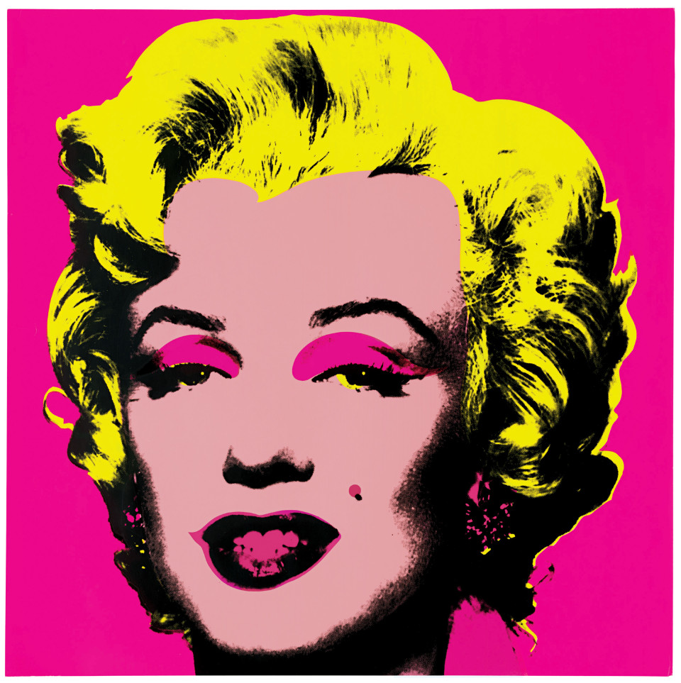
As an example, consider Andy Warhol’s famous picture of Marilyn Monroe.
His picture was hardly the first one of the actress — having graced the silver screen for years, Marilyn Monroe was already a familiar face to millions of Americans.
In the hands of Warhol, however, Monroe’s face became new again.
A palette of yellow, pink, and black transformed the actress’ visage into a garish, otherworldly cartoon:
You may not be Andy Warhol but you can still use color palettes to produce stunning results.
They key is finding the right colors to use.
To find great palettes, check out ColourLovers and Coolors.
By browsing these websites, you can find a stunning color palette in minutes without having any sort of graphic design skills.
Hack #2 – Ensure a Contrast
Ever hear the expression, “like night and day?”
It’s used to convey the strong difference(s) between two things.
The expression works because night and day are two things that clearly contrast. Barring an occasional exception, nighttime – with darkness, cooler temperatures, and other characteristics – is nothing like daytime.
The contrast between the two therefore allows each to stand out in its own right.
From a graphic design standpoint, we can also make use of contrasts.
Our contrasts may or may not be as severe as night and day, yet regardless of the severity, a contrast can still elevate our image and make up for limited graphic design skills.
Skeptical?
Look back to the Warhol image we just talked about.
In that image, Marilyn Monroe’s yellow hair stands out in sharp contrast to the pink background. So too does the actress’ eyebrows and other facial features that have been painted black.
Want a more relevant example?
Check out this Facebook ad from Udemy:

The dark blue font contrasts perfectly with the bright yellow background making the words jump out on the screen. The white key also lends a hand with some great contrast to the background.
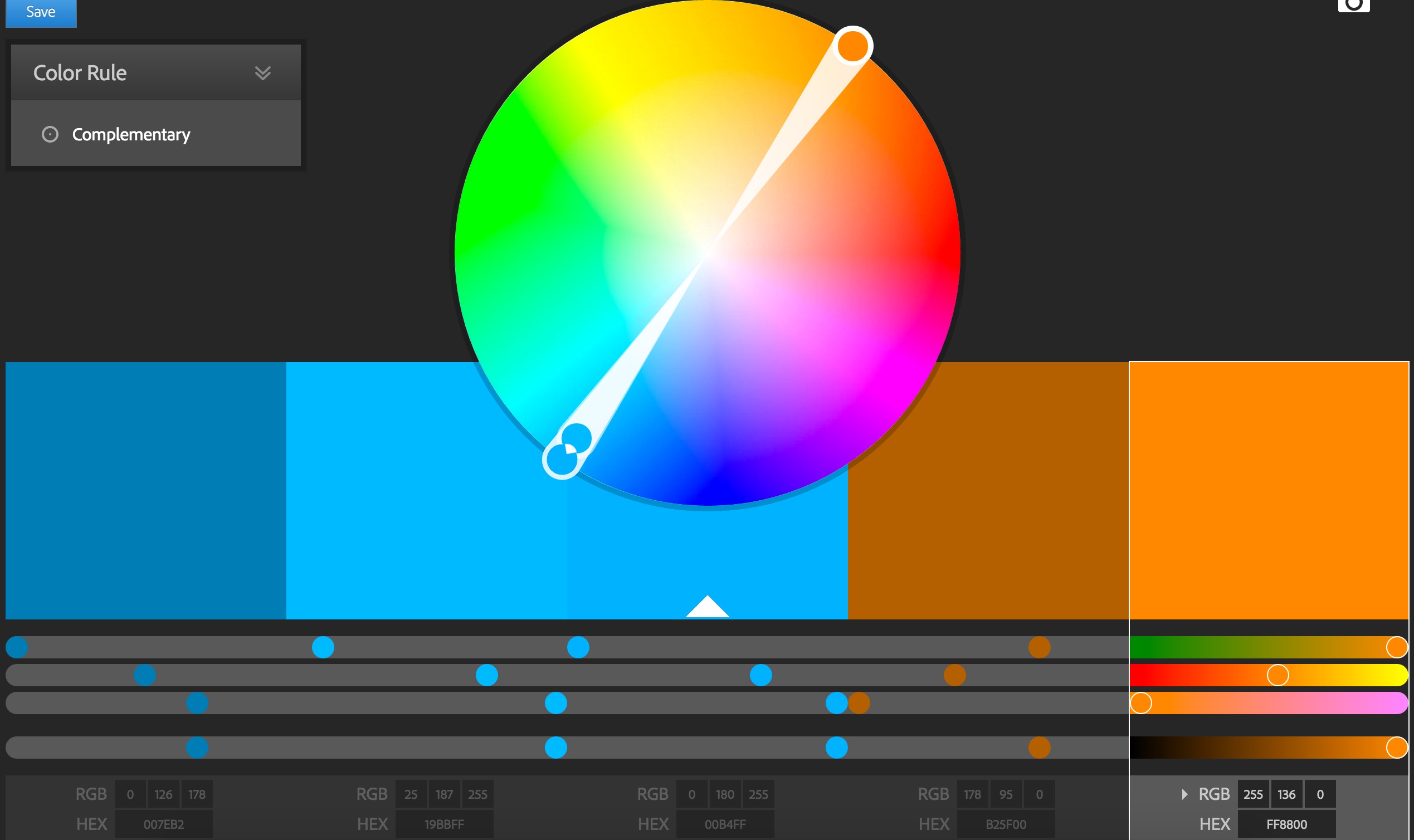
Not sure which colors contrast?
Just whip open the Adobe Color Wheel and select the complimentary option.
Hack #3 – Use Transparency
Another way for you to hack graphic design is to use transparency. By “transparency,” I’m referring to elements in an image being “see-through.”
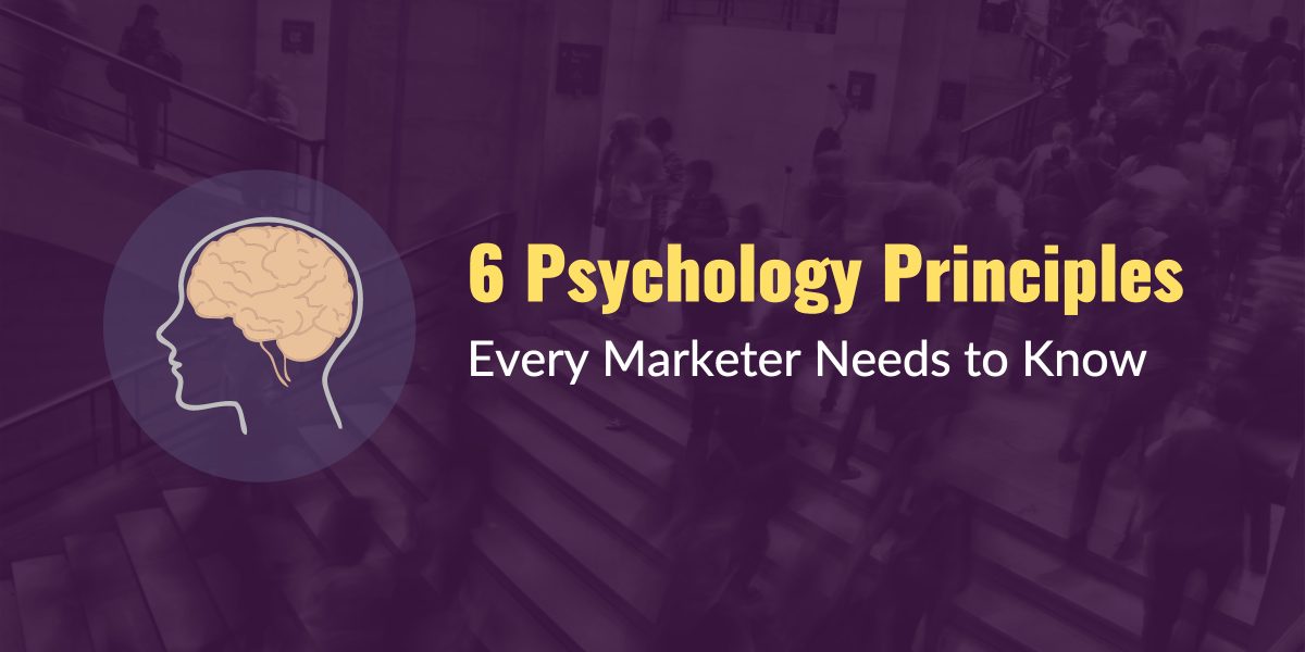
Here’s an example of transparency in action:
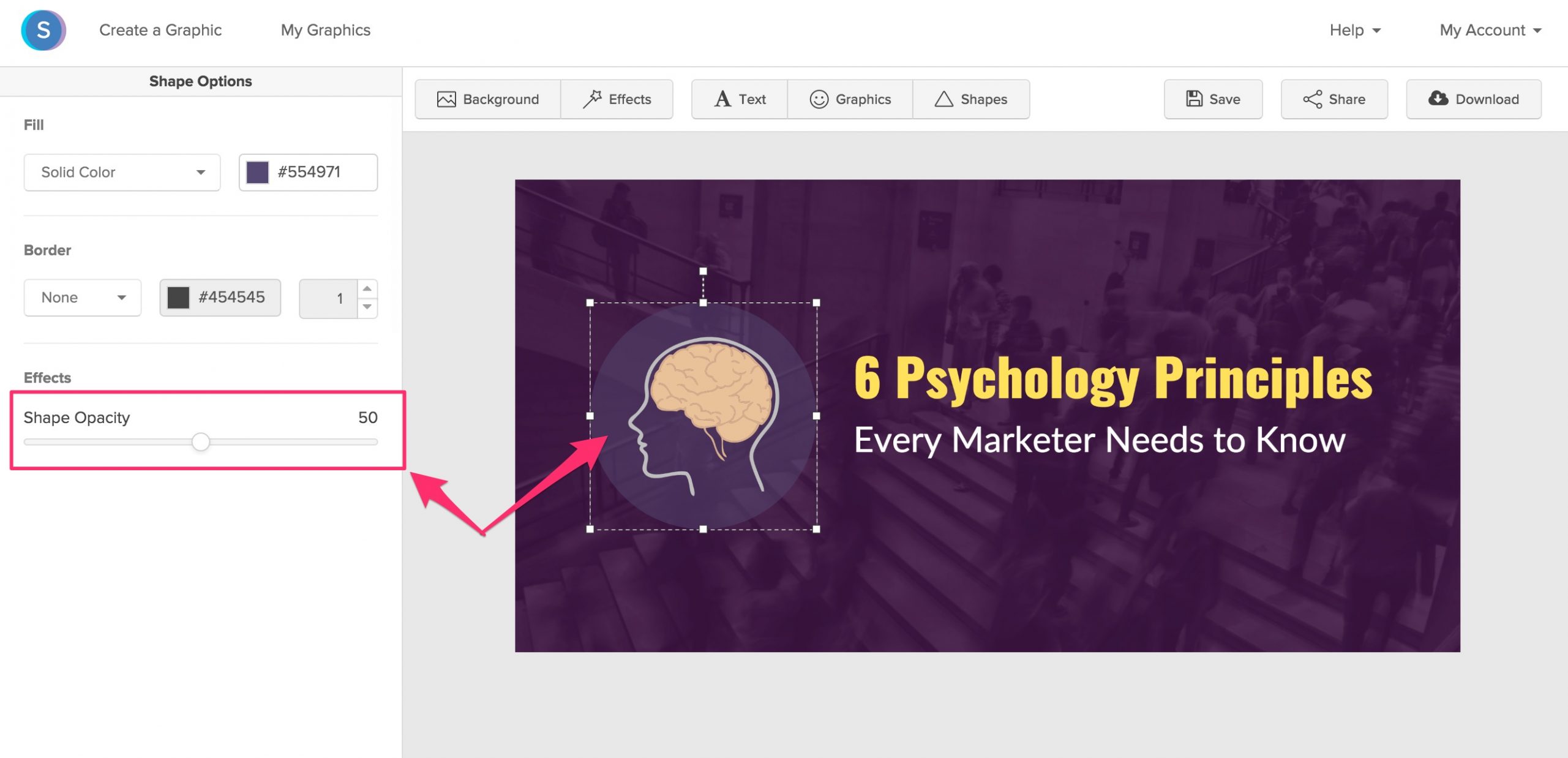
The image above uses transparency to blend together two distinct elements. These elements are blended against a background image of people bustling up and down steps.
In their current state, the two elements fit together perfectly. No one element crowds or detracts from the other, despite them all sharing the same space.
This sense of “harmony” is a direct result of transparency.
Suppose, however, that transparency had not been used. In that case, the brain image would likely be at odds with the image of people on the steps. It might appear, for example, as though the brain were “rolling” down the steps.
Transparency will allow you, the non-designer, to blend your image’s elements together with the same skill as a seasoned graphic artist.
This means less stress over how to make elements “work” in an image.
In case you’re worried that this technique is too advanced for a non-designer like yourself, don’t be.
With an easy to use graphic design tool like Snappa, anyone can add transparency to their images with ease.
Hack #4 – Embrace White Space
With all this talk about palettes and contrasts, let’s not discount white space.
Sometimes white space makes an effective graphic design hack in itself. Clothing retailer American Apparel certainly understands this idea.
Here’s an ad they ran in August of 2014:

Notice how the ad lacks anything in the middle of its left side.
After the headline “School Days,” there is a gaping expanse of white space — nothing exists there. The only remaining text in the ad is hidden in a small font at the very bottom.
Why create an ad that wastes so much space?
One explanation is that the wasted space is in keeping with American Apparel’s “don’t give a funk” attitude. While that may be part of it, a more likely explanation is that the company’s ad creators understand the value of white space.
By embracing white space underneath the headline, the ad compels its readers to look at the picture. A reader’s eyes will naturally move toward this picture because there’s little else for them to look at.
And that’s fine for American Apparel because the clothes are their ad’s main selling point. The more someone looks at the clothes, the more they’ll think about them and the greater the likelihood of a purchase.
American Apparel’s ad is also useful in showing how white space can cleanly separate the parts of an image. Separation is useful because it helps an image’s parts to have their own power.
We see this in the ad, as white space helps detach the ad’s headline from the picture.
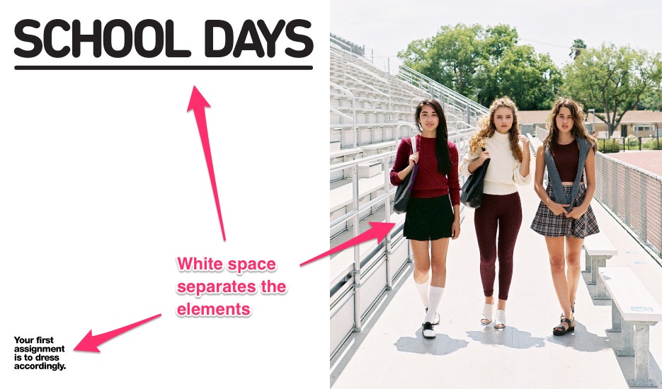
These two elements exist in separate sections of the page, where they can function independently and not compete for the reader’s attention. Readers can get a “clean” look at the clothes without having to simultaneously think about the headline.
Having this space enhances, rather than detracts from the ad’s effectiveness.
As a marketer, the takeaway for you from our discussion here is to embrace white space. White space can be a great way to enhance an image’s raw power.
And perhaps best of all, it means that you, the “graphically impaired” marketer, can do even less design work.
Now that’s a hack indeed!
Hack #5 – Pick Appropriate Fonts
Let’s start off with what not to do…

Look at the image above and you can spot five different fonts. That’s a problem because it confuses readers on which part of the text is most important.
Are we the reader supposed to focus on the date of the event? Or is it more important for us to understand that this event is “Big,” “Bold,” and “Booming?”
We might be able to answer that, if the image didn’t also use excessive capitalization and four different colors with the fonts.
Pick a font or two and leave it at that. There’s no need, in this image or your own, to go crazy with fonts.
Limit the number of fonts you use, so that your readers can be clear on what’s important.
You don’t want people having to guess, as we did, on what lines they should remember. Yet that’s exactly what will happen if you treat fonts like an all-you-can-eat buffet rather than a simple, two-course meal.
In contrast to the first image, check out this one.

Expecting a boatload of crazy fonts? You won’t find any in this second image.
The image employs a single font, written in two contrasting colors.
With this approach, there’s no risk of being “blown away” or disoriented by the text. Instead, both sections of text are easy to read and digest.
And for those of us who are marketers first and foremost, that’s exactly what we should shoot for.
Conclusion
Often you can create effective, visually attractive images through simple tricks.
We’ve outlined a few of those tricks here, such as using contrast and strategically choosing a color palette.
Keep such hacks in mind going forward and you can breathe a sigh of relief when it comes time to designing graphics for your blog content and social media.
You’ll have less stress, better images, and more time to be a marketing ninja.